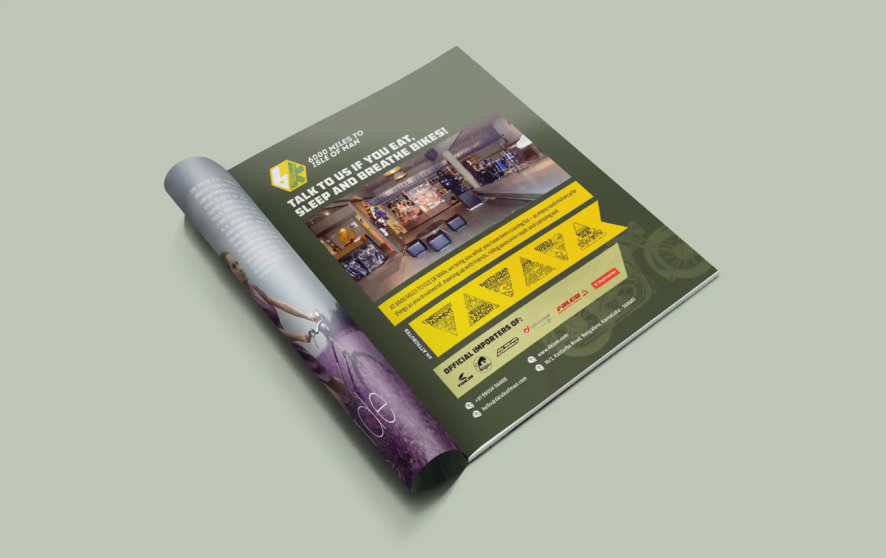
Magazine Ad: 6k Isle of Man
Designing a magazine advertisement for the vibrant “6k Isle of Man” biking community and store in India was a fascinating task. The name itself, “6k Isle of Man,” draws intrigue from its geographical location, 6000 miles away from the Isle of Man.
To infuse authenticity into the brand’s identity, their signature military green and yellow colour scheme was employed, creating a visual continuity that resonated with the biking theme. A watermark-style silhouette of a motorcycle adorned the background, inviting readers into the exhilarating world of biking adventures. At the heart of this advertisement was a captivating headline, bold and enticing. It beckoned readers to explore the community’s offerings, setting the tone for a thrilling experience. Beyond aesthetics, the advertisement also highlighted the brand’s values and commitments through their pre-existing illustrative icons. Accompanied by bullet points, enriched with an iconic helmet icon, key information was easily accessible.
In essence, this magazine advertisement wasn’t just about promotion; it was a visual narrative, encapsulating the spirit of “6k Isle of Man” and offering a glimpse into the exciting world of biking and camaraderie it represents.