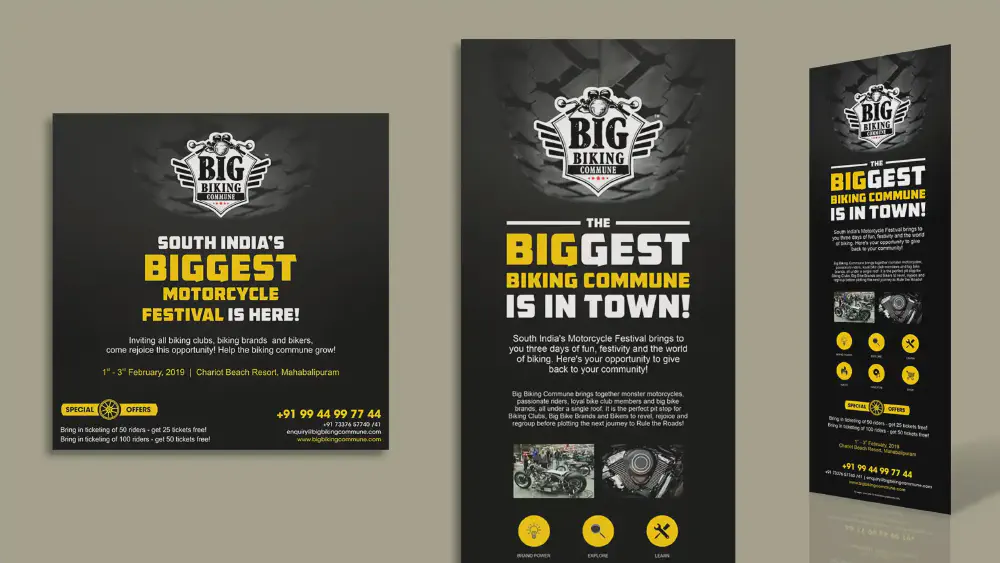


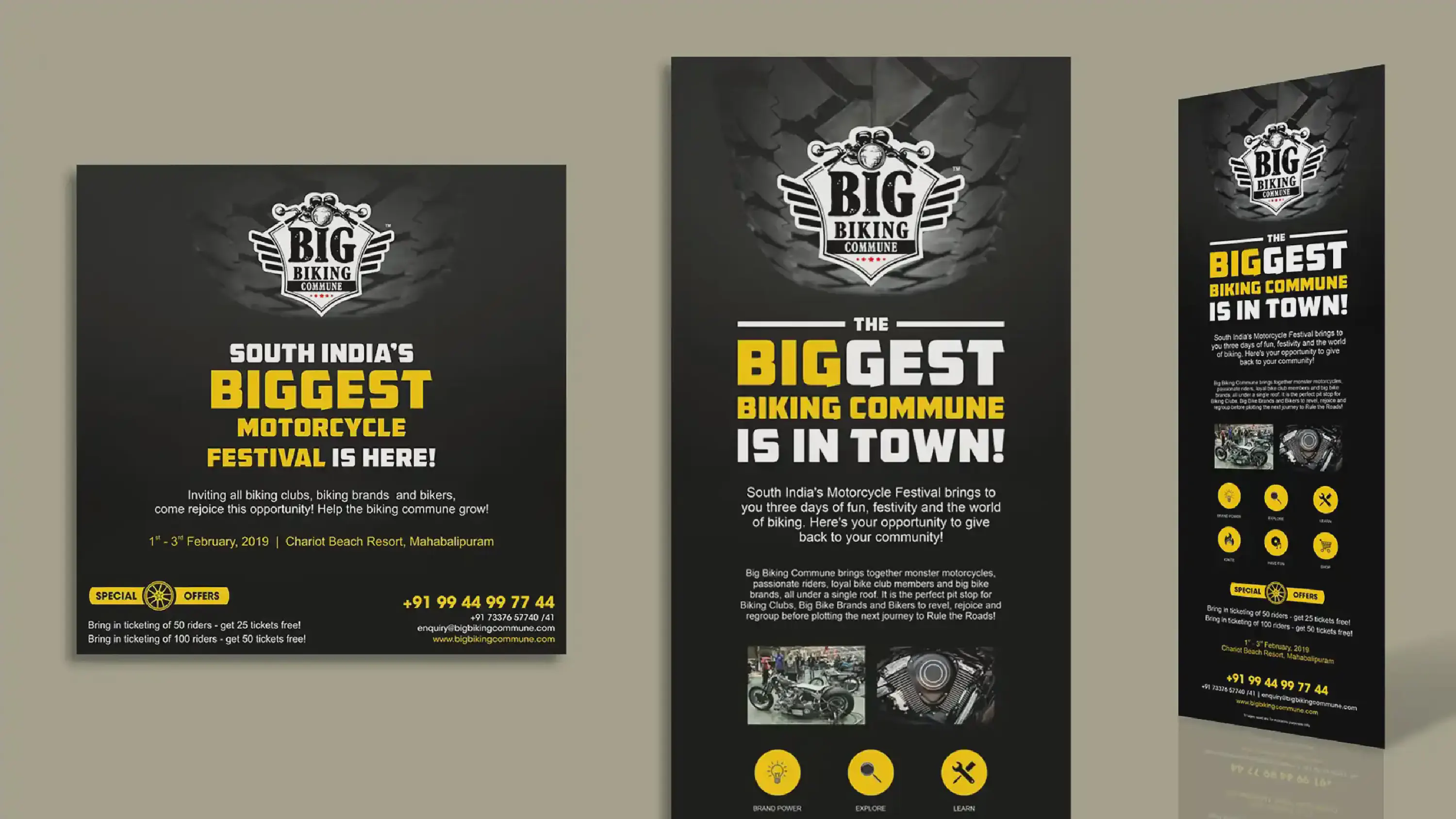
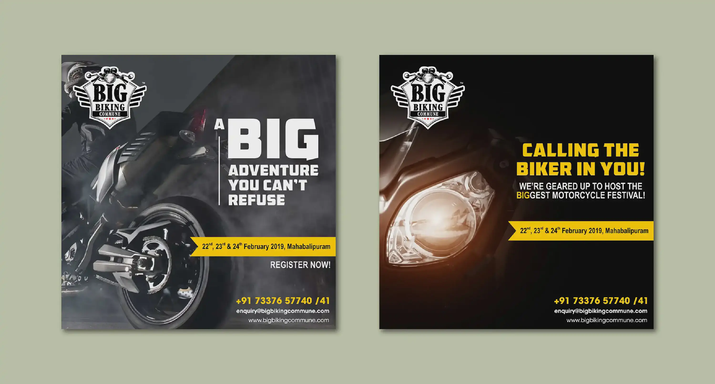
Big Biking Commune stands as a premier biking community in India, dedicated to exalting the very spirit of biking.
The task at hand involved crafting a promotional mailer and striking social media posts, aimed at illuminating an upcoming motorcycle festival orchestrated by the community, designed explicitly to beckon new members into its fold. Drawing inspiration, a bold and commanding font took center stage, complemented by a judicious selection of two distinct hues. Against a backdrop as deep as the night, the focal point was a motorcycle tire – an unmistakable emblem of motorcycling.
The outcome was an embodiment of Big Biking Commune’s core, that not only harnessed the power of design but also encapsulated the thrill and camaraderie intrinsic to the realm of biking.
In line with their requirements and the same creative vision, four additional social media posts were created for a different set of dates. They can be viewed here.
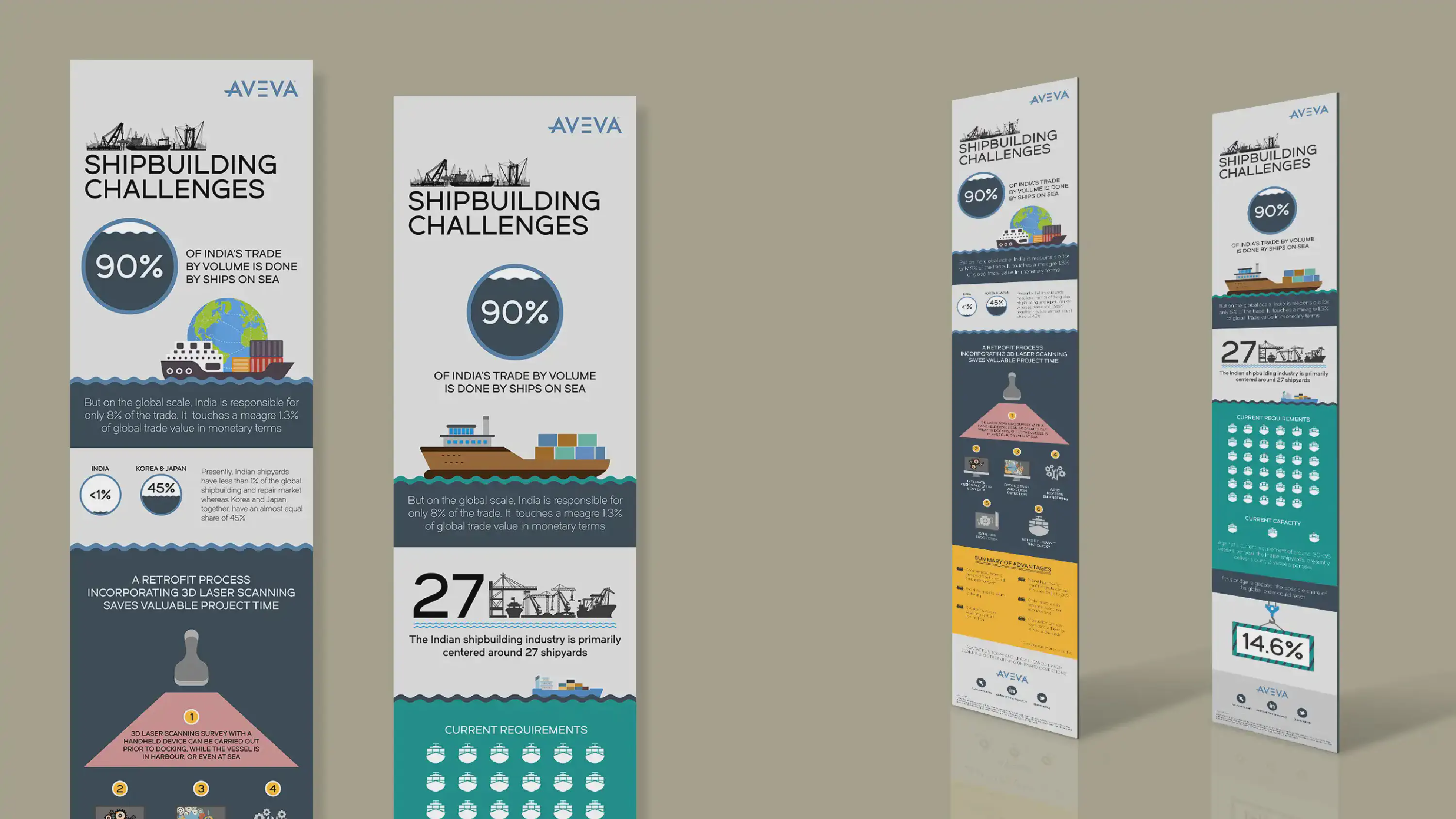
AVEVA, an esteemed I.T. consulting firm, found its wings under the Schneider Electric umbrella in 2023.
The task at hand beckoned for the creation of mailers adopting an infographic style. Their purpose was twofold: to spotlight a pertinent quandary plaguing India’s shipping trade and to present a compelling remedy in tandem. Harnessing the potency of visual communication, the infographics encapsulated the intricacies of the issue at hand. With strategic symbology and insightful data representation, the challenge facing the shipping industry was unveiled. A harmonious fusion of imagery and information converged to illuminate the pressing concern.
Furthermore, ingeniously integrated into this visual narrative was the proposed solution—a beacon of innovation and pragmatism. The symbiotic blend of textual insights and graphical elements coalesced to map out the transformative path forward. This endeavor was a testament not only to AVEVA’s proficiency but also its commitment to instigate impactful change through the synergy of strategic consulting and creative visualization.
Other work done for AVEVA: 2019 & 2020 Corporate Calendars

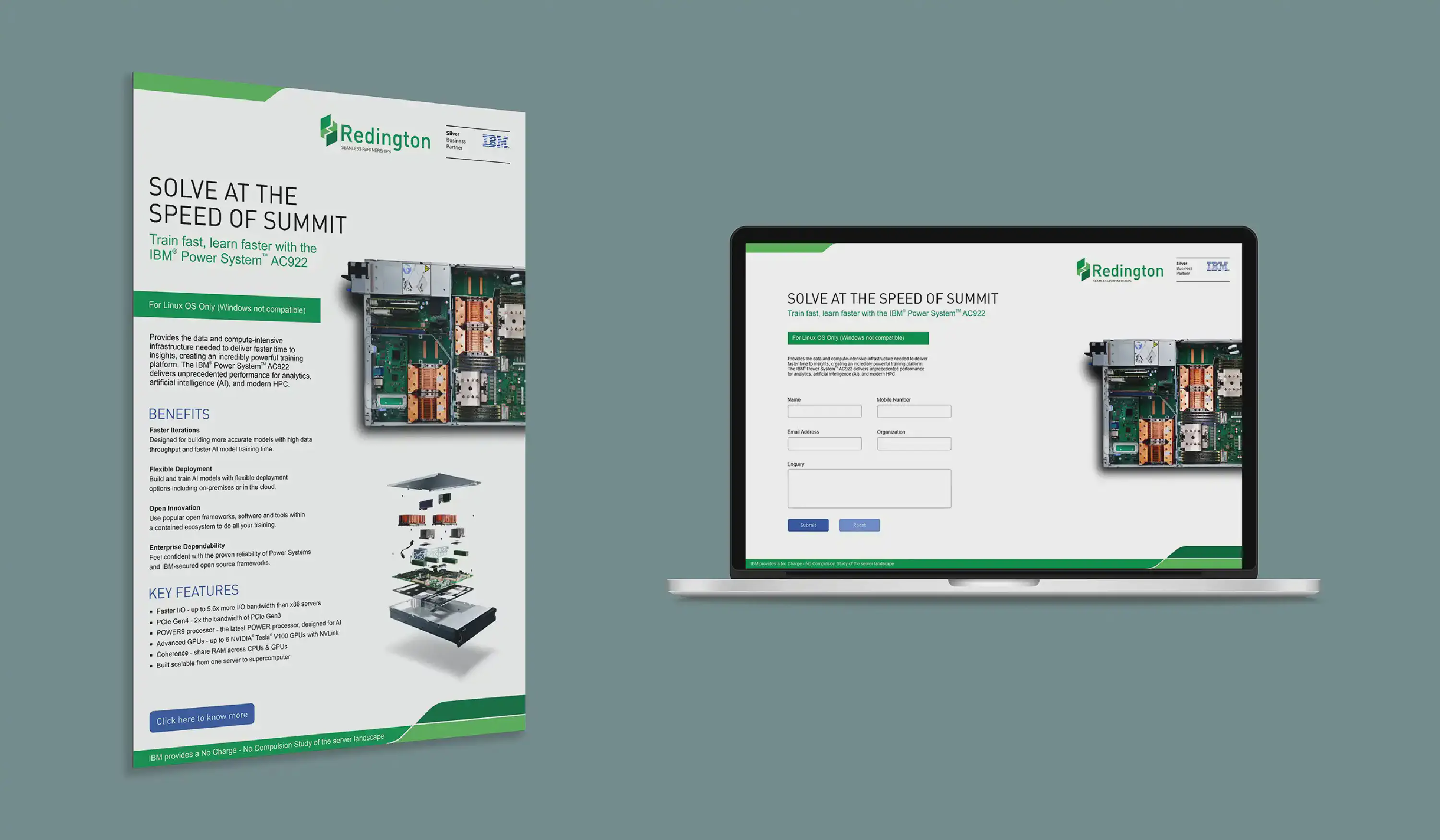
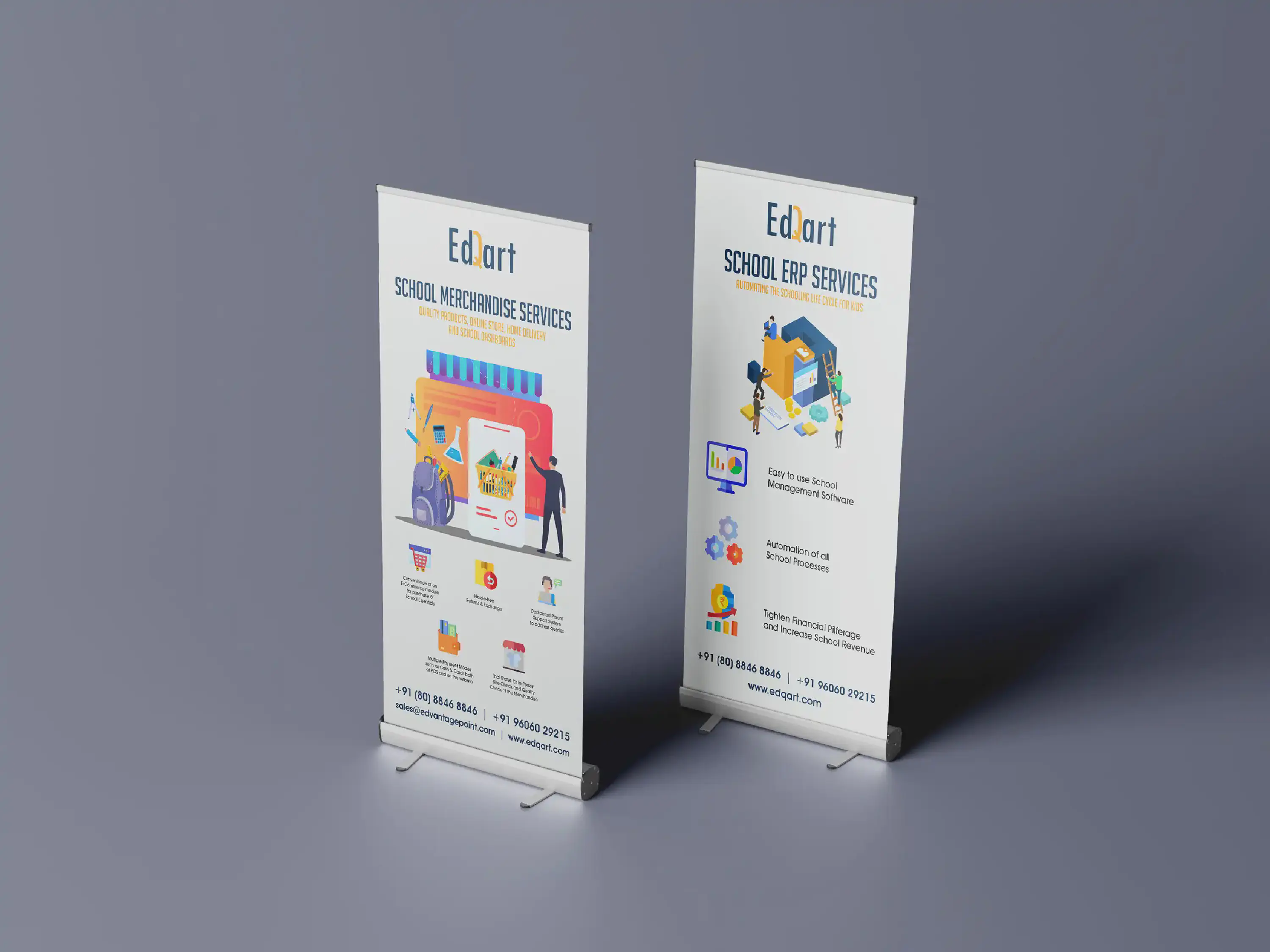
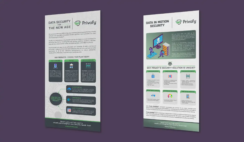
The directive encompassed the creation of emailers focused on the pivotal theme of data security for Privafy, a forward-thinking entity championing a state-of-the-art cloud-based Software-as-a-Service solution meticulously tailored to cater to the distinctive requisites of carriers, IoT networks, and enterprises.
The first mailer served as an introduction to Privafy, unveiling its core essence. Furthermore, its prime audience – carriers, IoT networks, and enterprises – who stand to reap immeasurable benefits from its offerings were highlighted. The background wove a visual tapestry of connectivity and security with a subtle yet evocative image of circuitry and data flow. Additionally, attractive icons and their corresponding bite-sized explanations to forge a bridge between complexity and comprehension were also used. These visual cues transformed mere points into a compelling narrative, inviting recipients to explore the multifaceted dimensions of Privafy’s comprehensive security solution.
Transitioning to the second emailer, the spotlight was cast upon the stark reality of data theft, embodied by a central image that resonated with urgency. This visual tableau served as a rallying cry, underlining the very challenge that Privafy gallantly combats. Once again, icons and concise descriptions converged to spotlight other crucial facets, fostering an intuitive grasp of the company’s breadth.
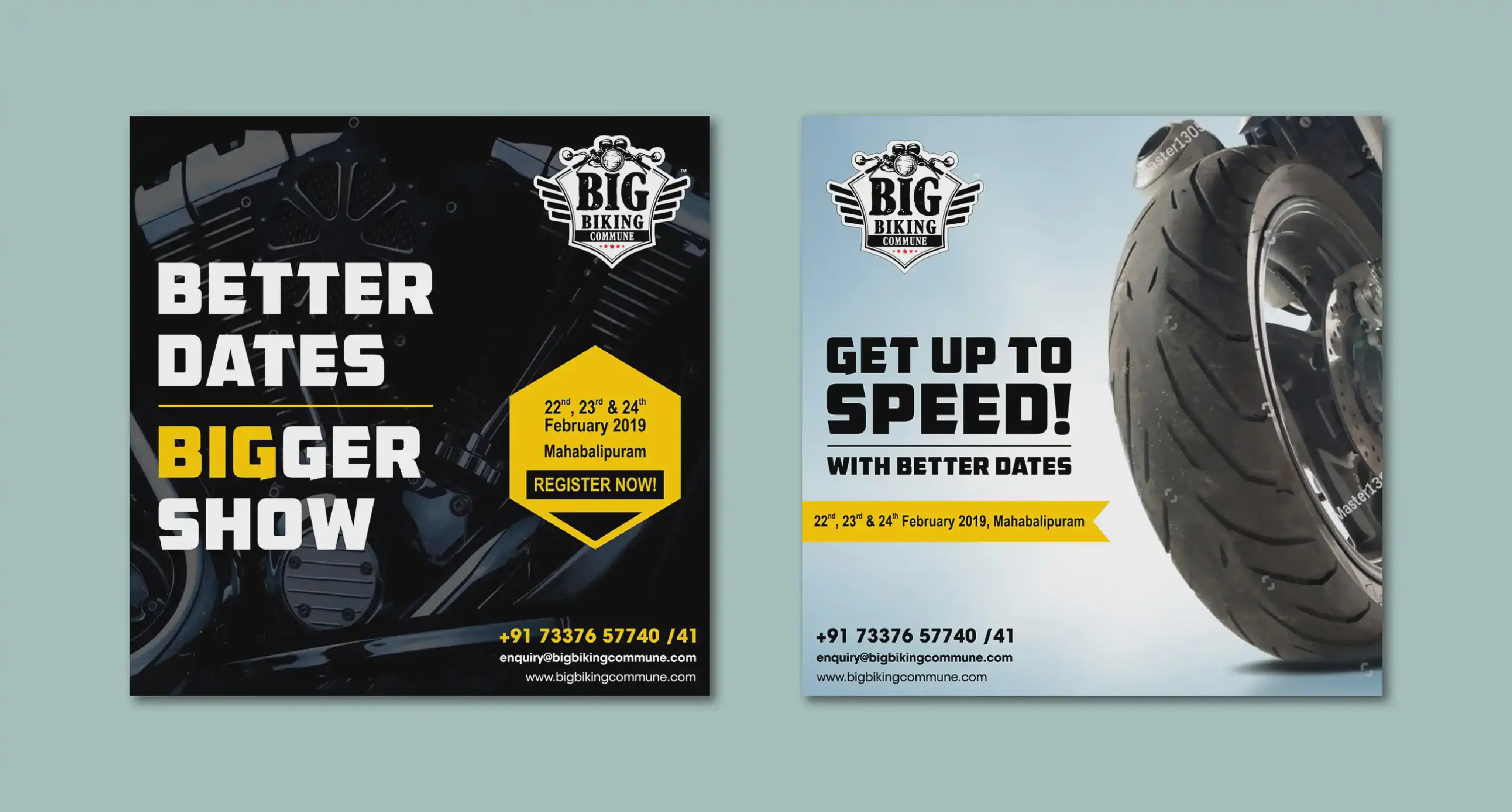
Big Biking Commune stands as a premier biking community in India, dedicated to exalting the very spirit of biking.
The task at hand involved crafting a promotional mailer and striking social media posts, aimed at illuminating an upcoming motorcycle festival orchestrated by the community, designed explicitly to beckon new members into its fold. Drawing inspiration, a bold and commanding font took center stage, complemented by a judicious selection of two distinct hues. Against a backdrop as deep as the night, the focal point was a motorcycle tire – an unmistakable emblem of motorcycling.
The outcome was an embodiment of Big Biking Commune’s core, that not only harnessed the power of design but also encapsulated the thrill and camaraderie intrinsic to the realm of biking.
The original mailer and single social media post can be viewed here.

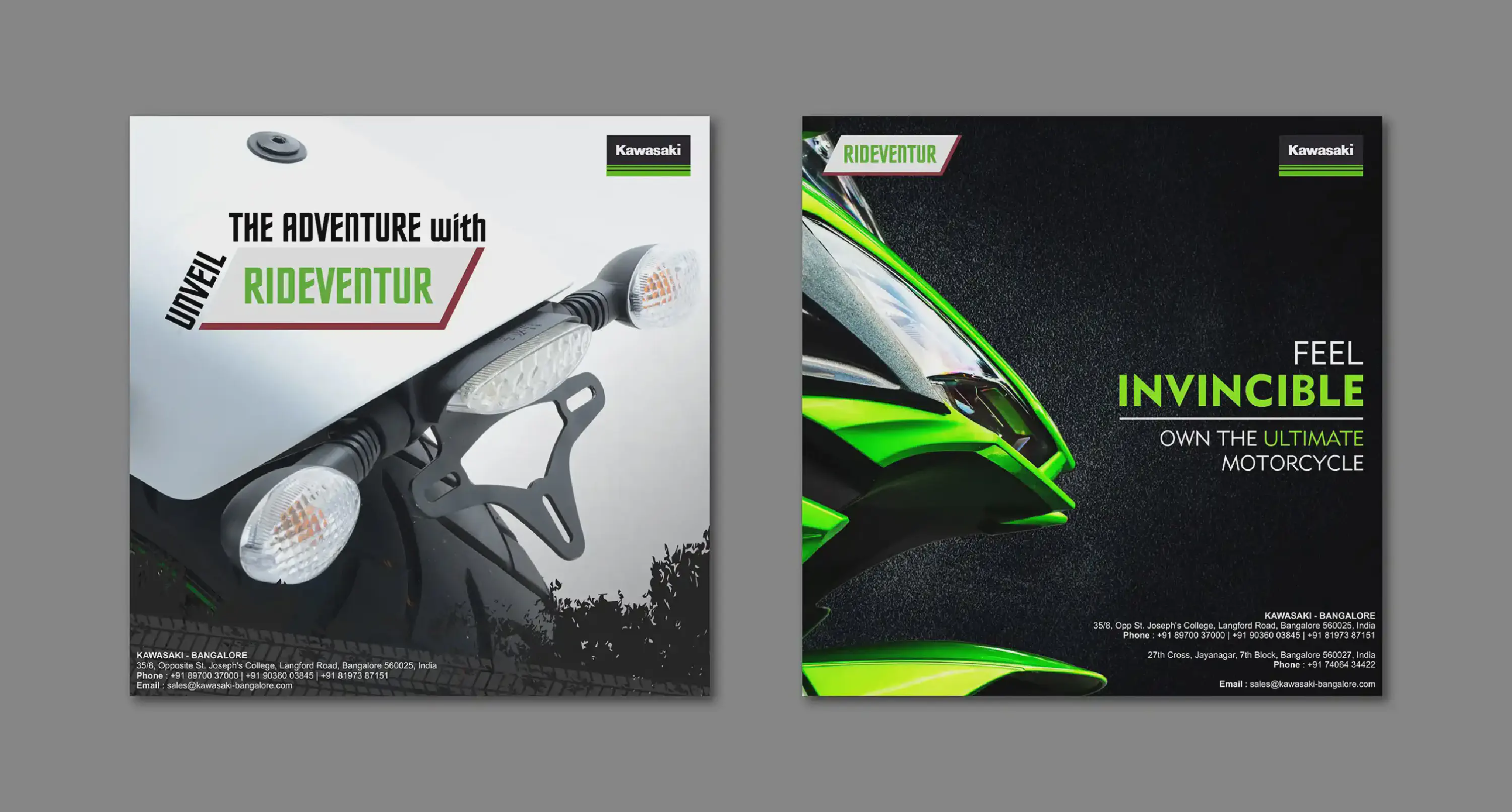
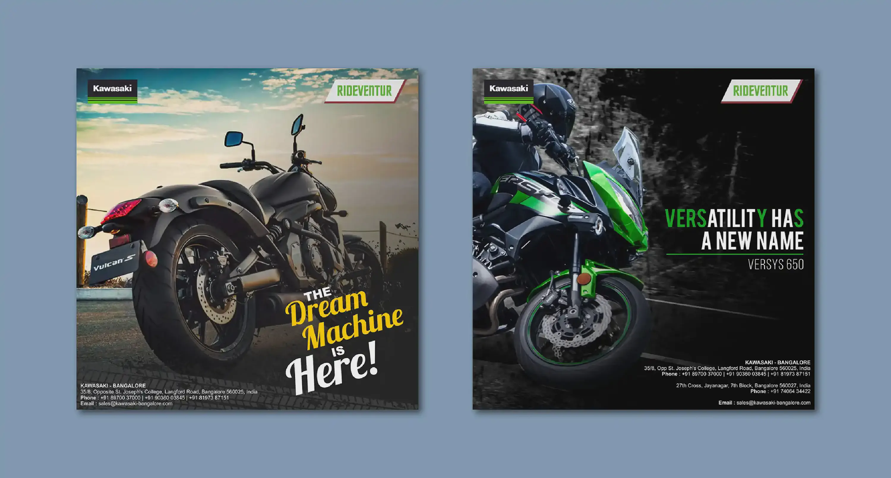
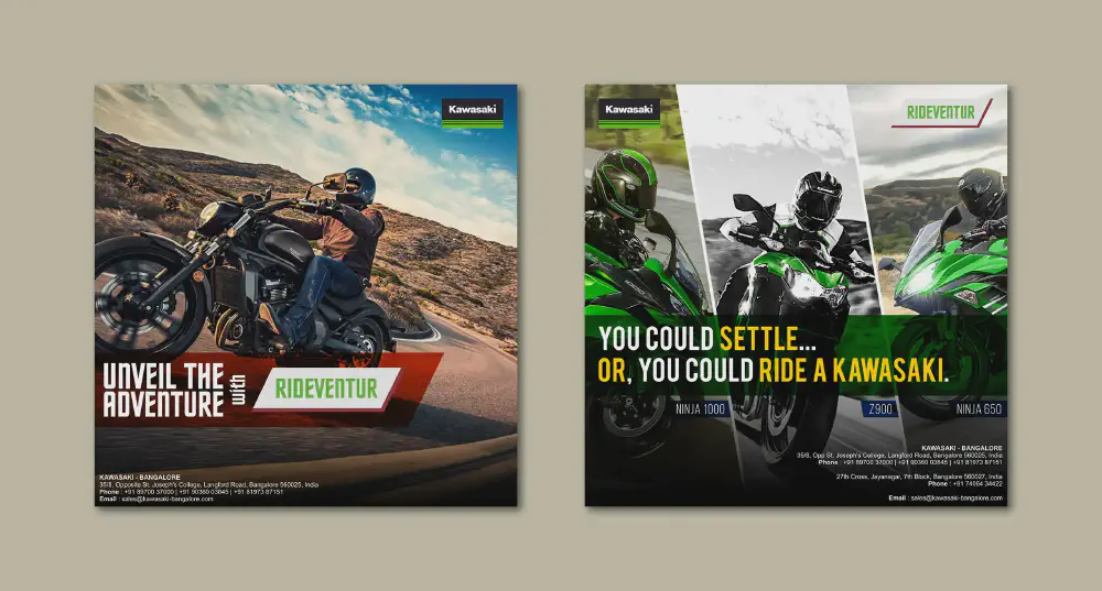
The task entailed creating a captivating series of social media posts, strategically designed to amplify the launch of Kawasaki Bajaj’s exhilarating range of motorcycles for the first time in the Indian market. The design direction embraced bold typography, accentuated by the iconic Kawasaki green hue, which made frequent appearances, ensnaring attention with every scroll.
Kawasaki is known for their engineering prowess and a legacy of speed. With a history etched in adrenaline and innovation, Kawasaki’s two-wheeled marvels are a symphony of power, precision, and style. This very essence was translated into the social media campaign, where dynamic visuals and commanding fonts echoed the spirit of their motorcycles, witht the aim of captivating Kawasaki enthusiasts across India.
Other work done for Kawasaki: Mailers

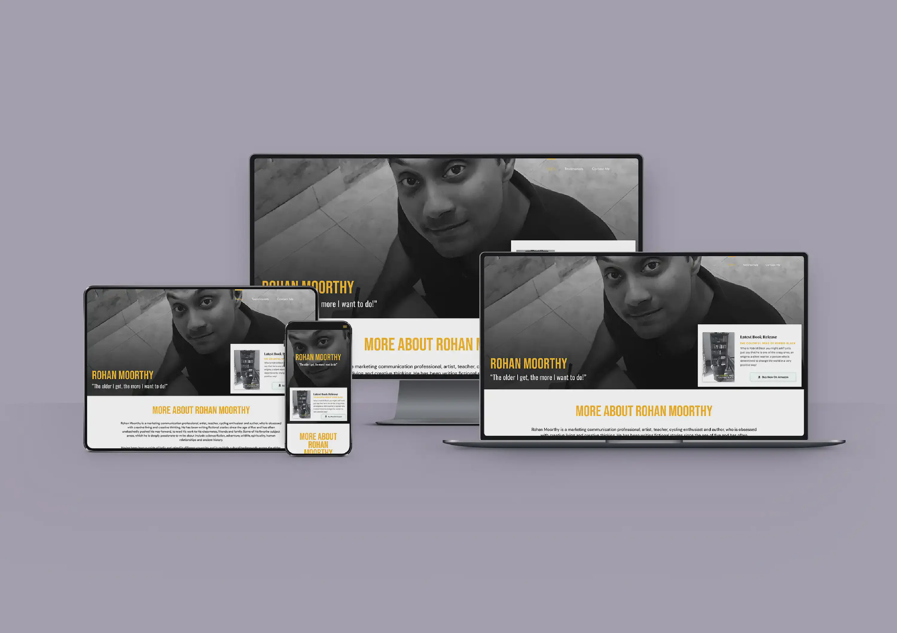
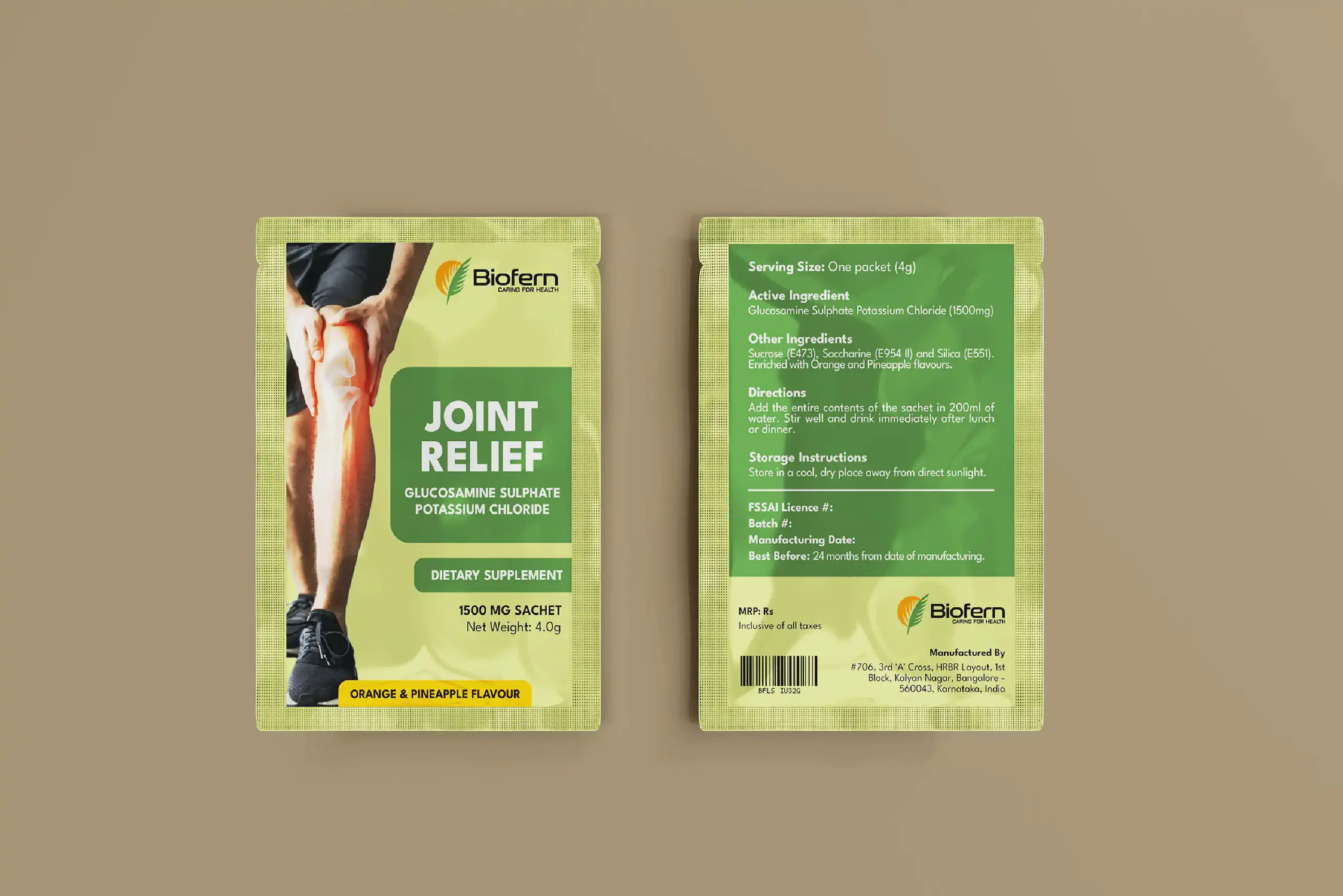
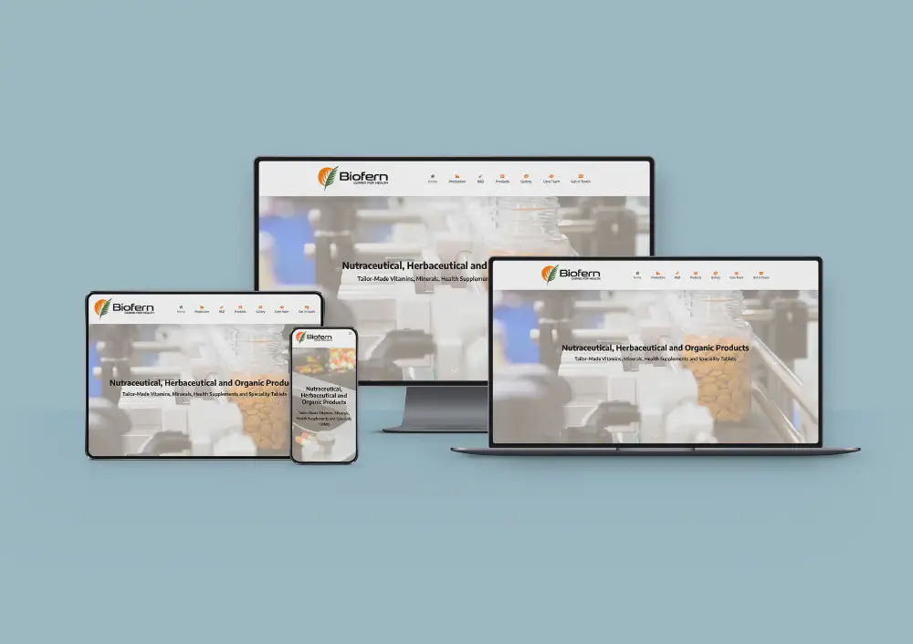
The task at hand was to conceive a fresh and dynamic corporate website for Biofern Life Sciences, a pharmaceutical company. The website seamlessly integrated the brand’s logo colours, saffron and green into its design, elegantly framing borders, menus, and buttons throughout the site.
At the forefront of the website’s visual allure were striking, high-definition images that showcased the intricate process of medicine production. These captivating visuals served as hero images, commanding attention and complemented by bold headlines that succinctly conveyed Biofern’s commitment to excellence.
What made this project particularly remarkable was the utilisation of WordPress, a versatile platform that allowed me to build the entire website without the need to delve into code. This user-friendly approach ensured that the website was not only visually appealing but also highly accessible and easy to navigate.
In the end, the website emerged as a testament to the fusion of design prowess and technological efficiency. It effortlessly encapsulated the essence of the company, inviting visitors into a world of innovation and dedication, all with the click of a button.

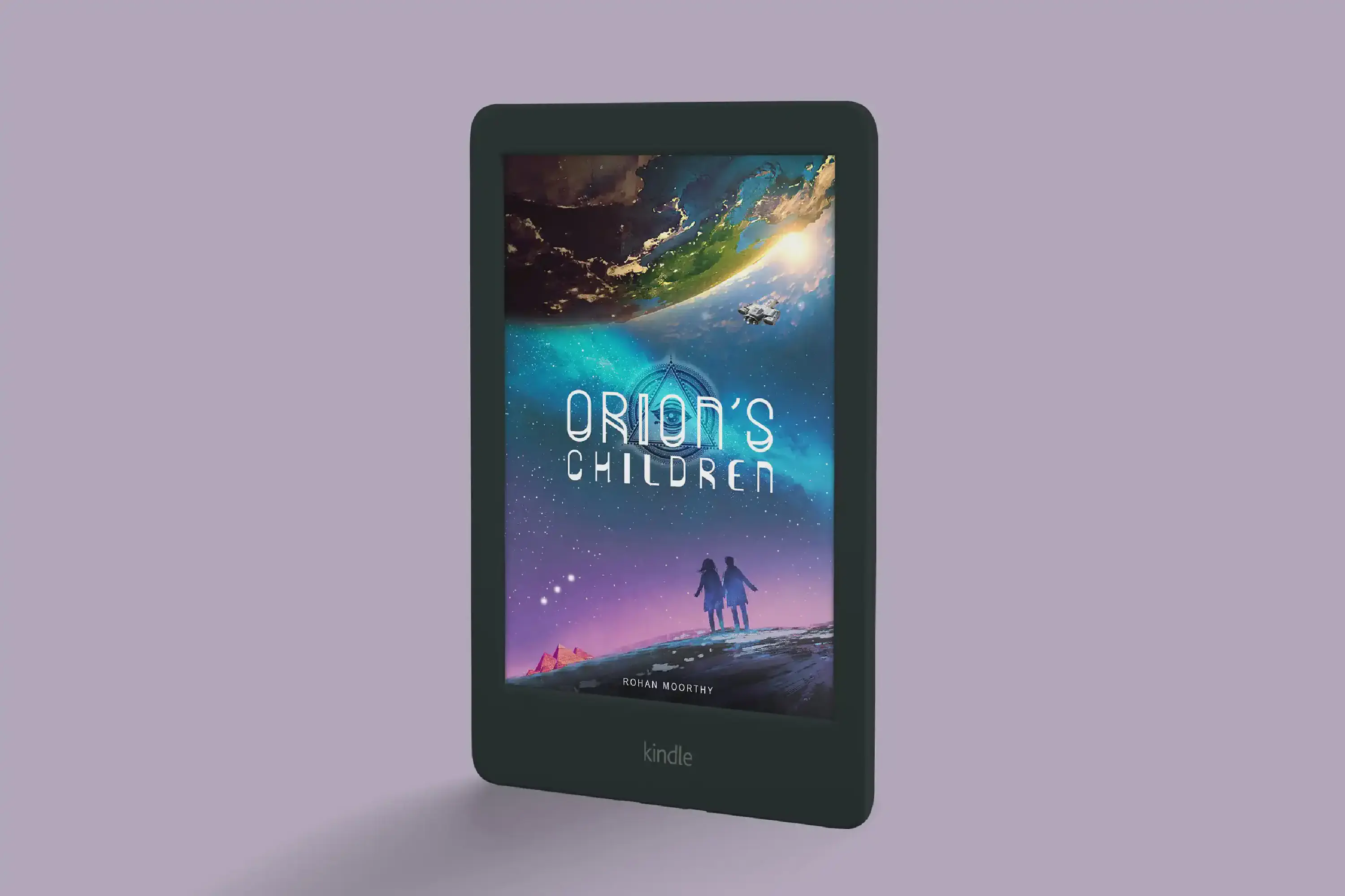
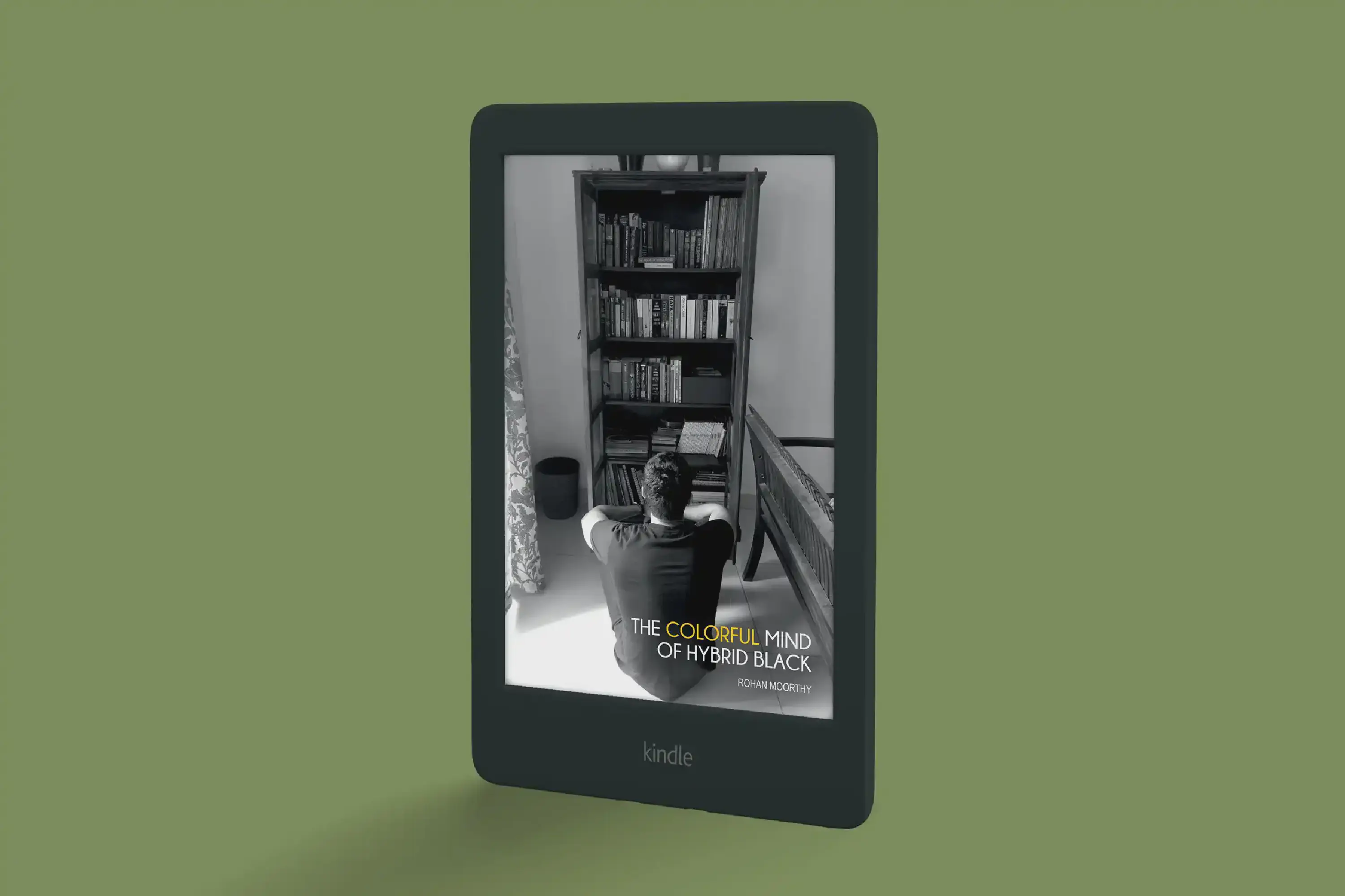
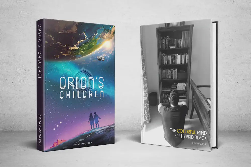
A dear and close friend of mine reached out with an exciting proposition: designing a cover for his Science Fiction book that he had masterfully penned. Before embarking on the creative journey, I fully immersed myself in the intricacies of the story by reading the entire book. Only then did I begin to contemplate what could grace the cover. Through a process of merging five distinct images, a singular composition emerged that eloquently encapsulated the essence of the narrative – a visual homage to the tale within.
The second project was an unconventional Autobiography, distinctively narrated from a third-person perspective. The cover image, captured by an intimate friend of the author, was a stroke of understated brilliance. This photo subtly yet perfectly captured the core essence of the book, serving as a visual riddle that hinted at the story’s heart.
Ultimately, these literary creations found their place on Amazon’s platform, available in both Paperback and Kindle formats. The covers, meticulously designed and deeply meaningful, serve as befitting introductions to the stories within, resonating with the essence of the narratives they enshroud.
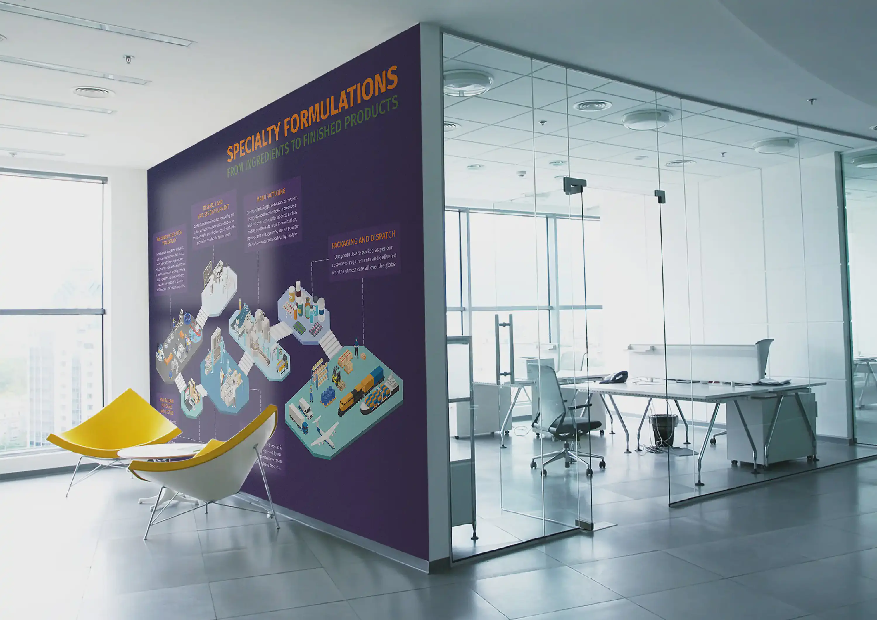
Elevating the essence of Biofern Life Sciences, a pharmaceutical company, the interior office branding meticulously unveils the intricacies of their manufacturing process. This immersive display grants a comprehensive insight into their operations, fostering transparency and showcasing their commitment to excellence.
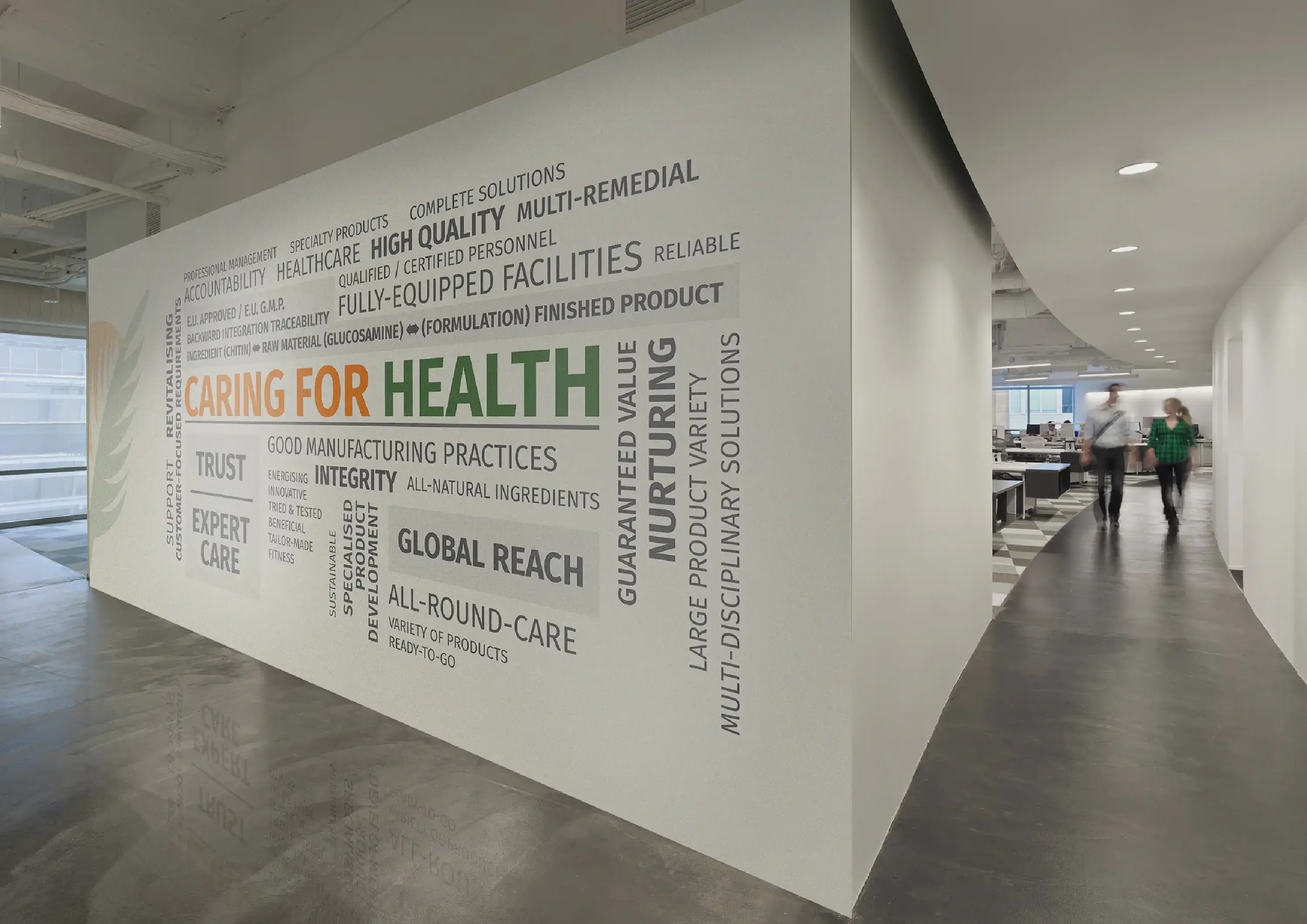
Moreover, the conference room is adorned with a thought-provoking word cloud that encapsulates relevant content, fostering an environment of productive discourse. This carefully curated design reflects the company’s commitment to both innovation and meaningful collaboration.
Note: The mockups of the office interior are for indicative purposes only.
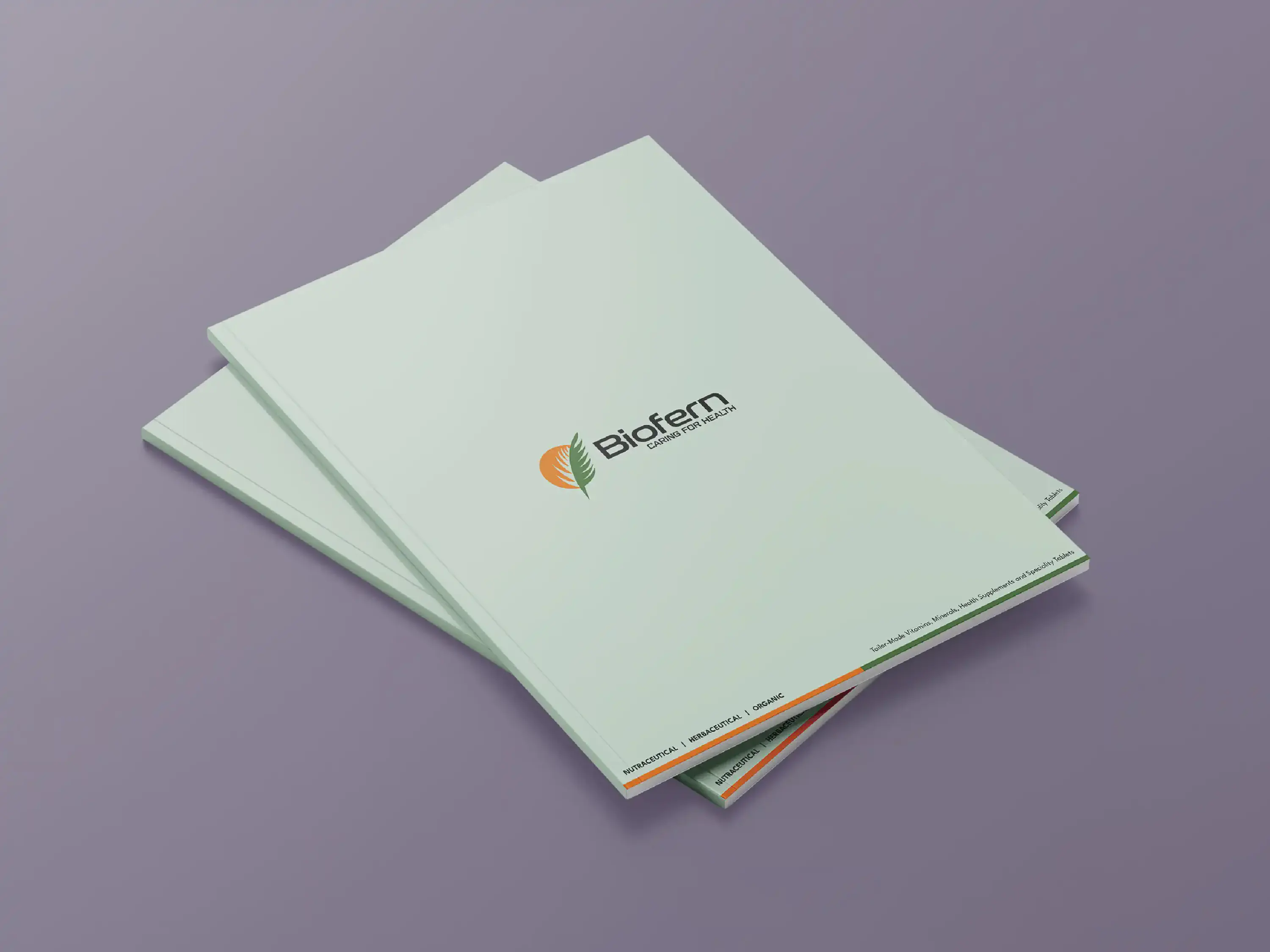
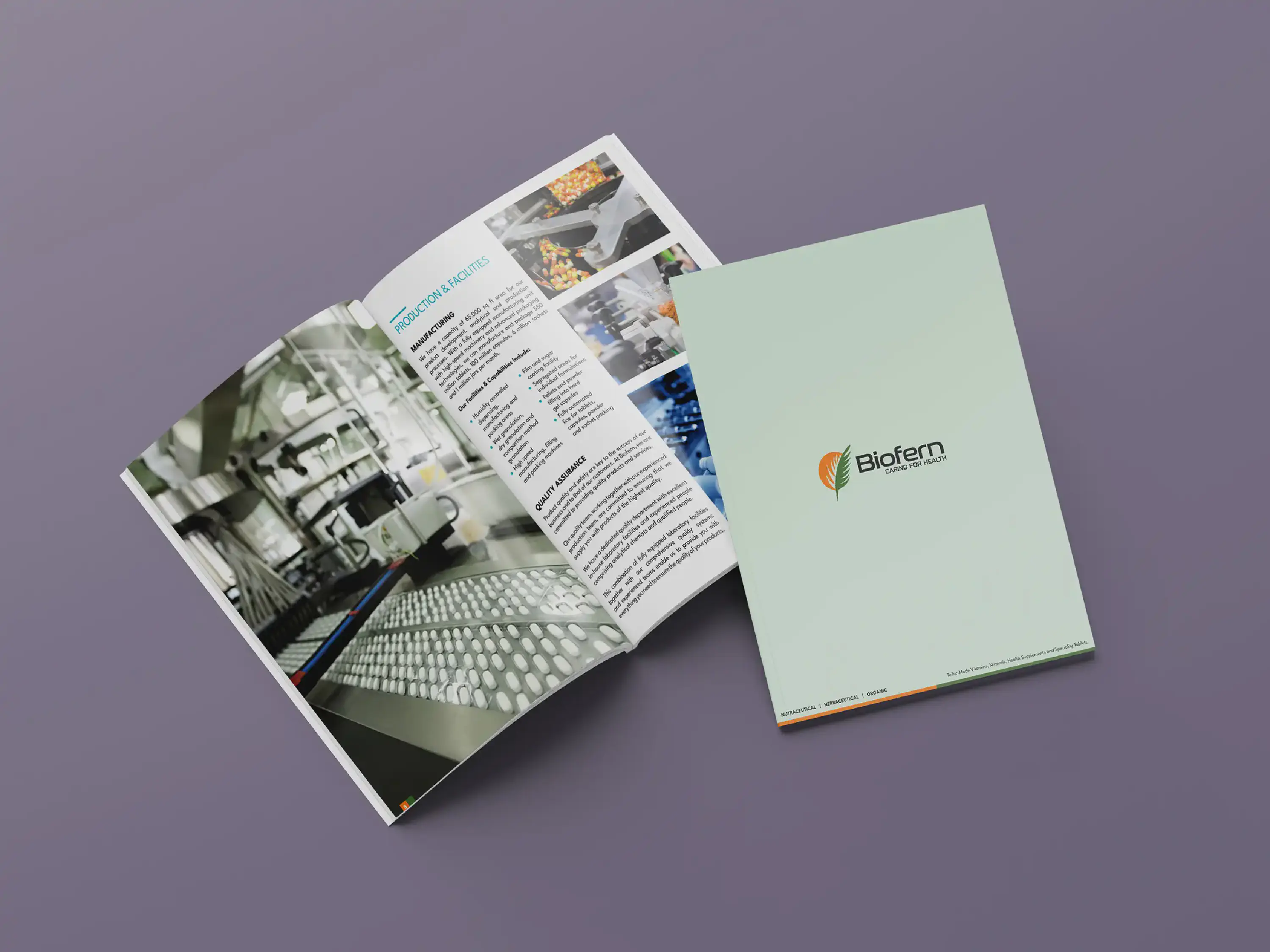
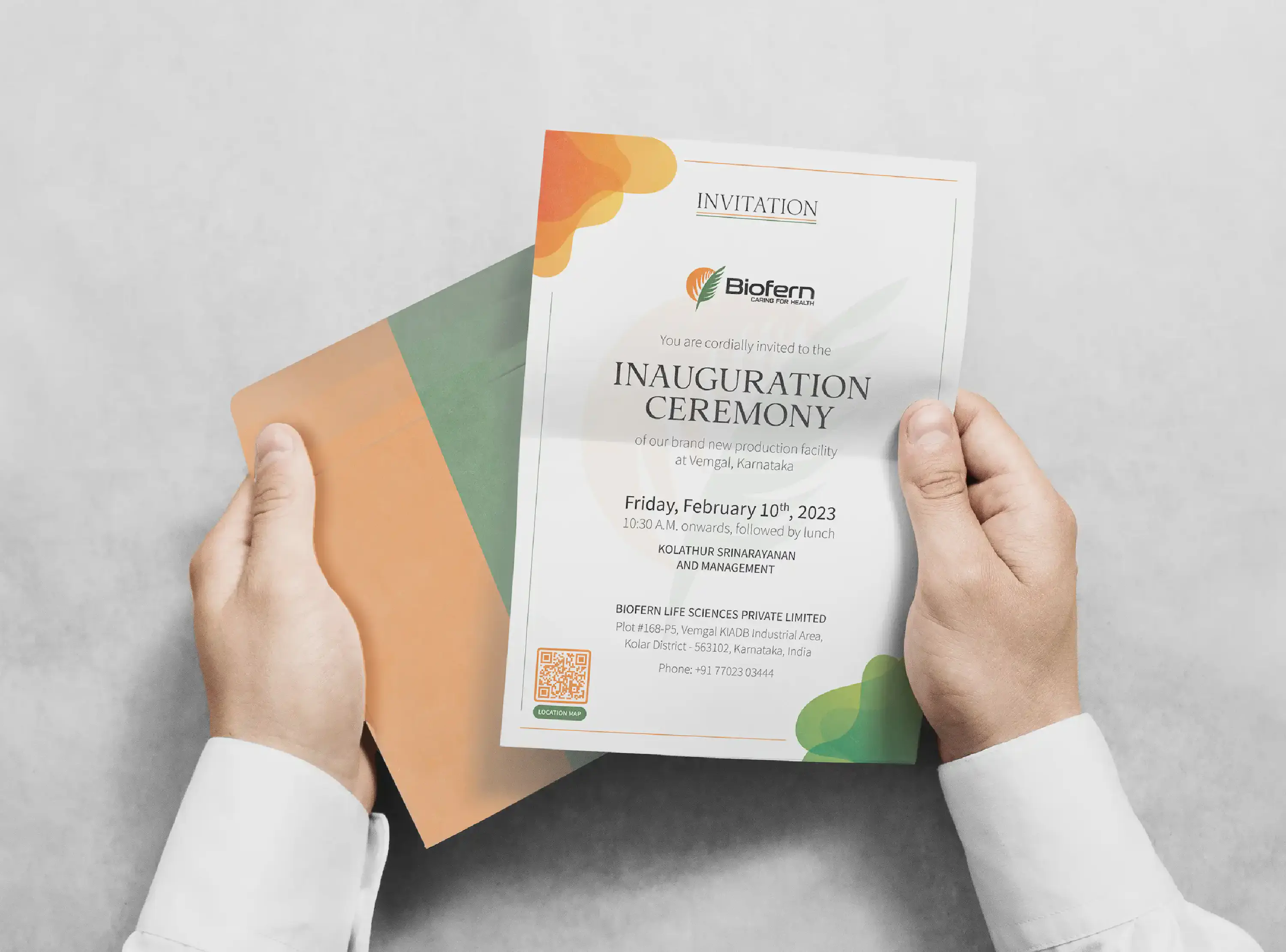
The task at hand was to craft a stellar corporate brochure for Biofern Life Sciences, a pharmaceutical company. The brochure was to encapsulate the very essence of Biofern’s journey, its commitments, and its comprehensive capabilities. My creative expedition embarked with the mission of distilling Biofern’s narrative into a captivating brochure. As the colours of the brand danced across the canvas, they became more than just hues; they evolved into carriers of the company’s identity, signifying trust, expertise, and progress.
The pages unfolded a chronicle that commenced at Biofern’s inception, navigating the annals of time through an elegantly depicted timeline. Each milestone, etched with care, showcased the company’s unwavering trajectory towards excellence. The brochure transcended mere pages; it was a gateway into Biofern’s core. Isometric-style infographics painted a vivid canvas, intricately illustrating the manufacturing process – an art where science and precision coalesce. The distribution network, a lifeblood for pharmaceutical endeavours, found expression in a meticulously crafted world map.
Moreover, this endeavour extended beyond the corporate brochure. Complementing the core, three dedicated product brochures were also made, each tailored for a distinct product category, utilising the same design language and style as the corporate brochure.
In the end, the brochures emerged as a visual symphony, where colours, icons, and infographics danced in harmony. Beyond being mere documents, they stood as a testament to the company’s identity.
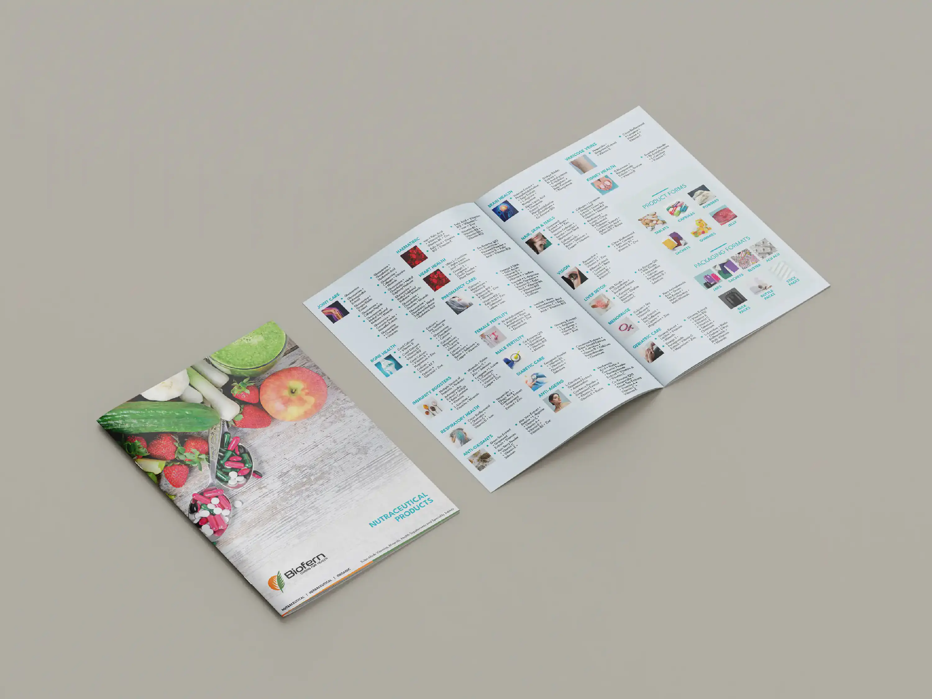
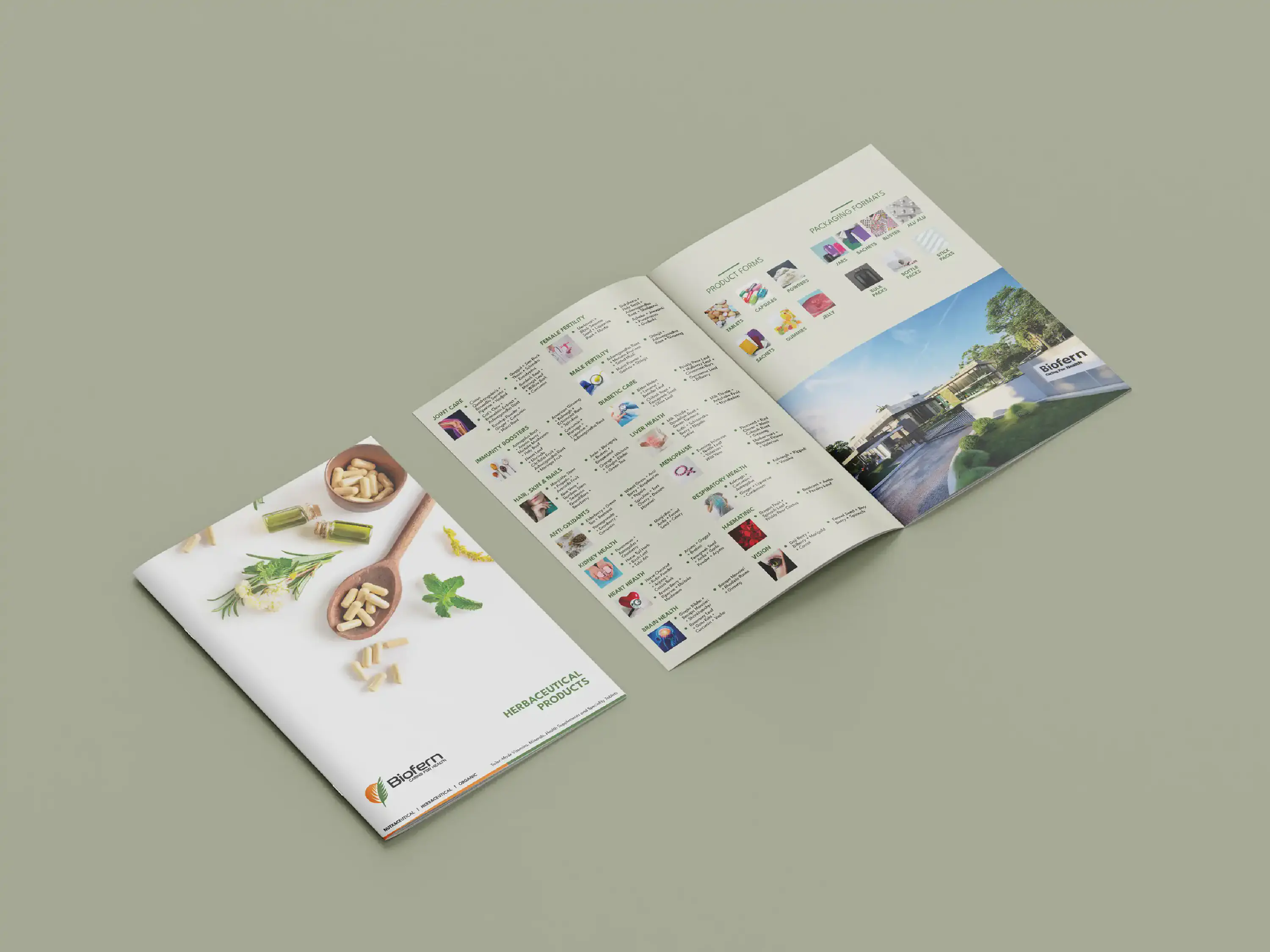
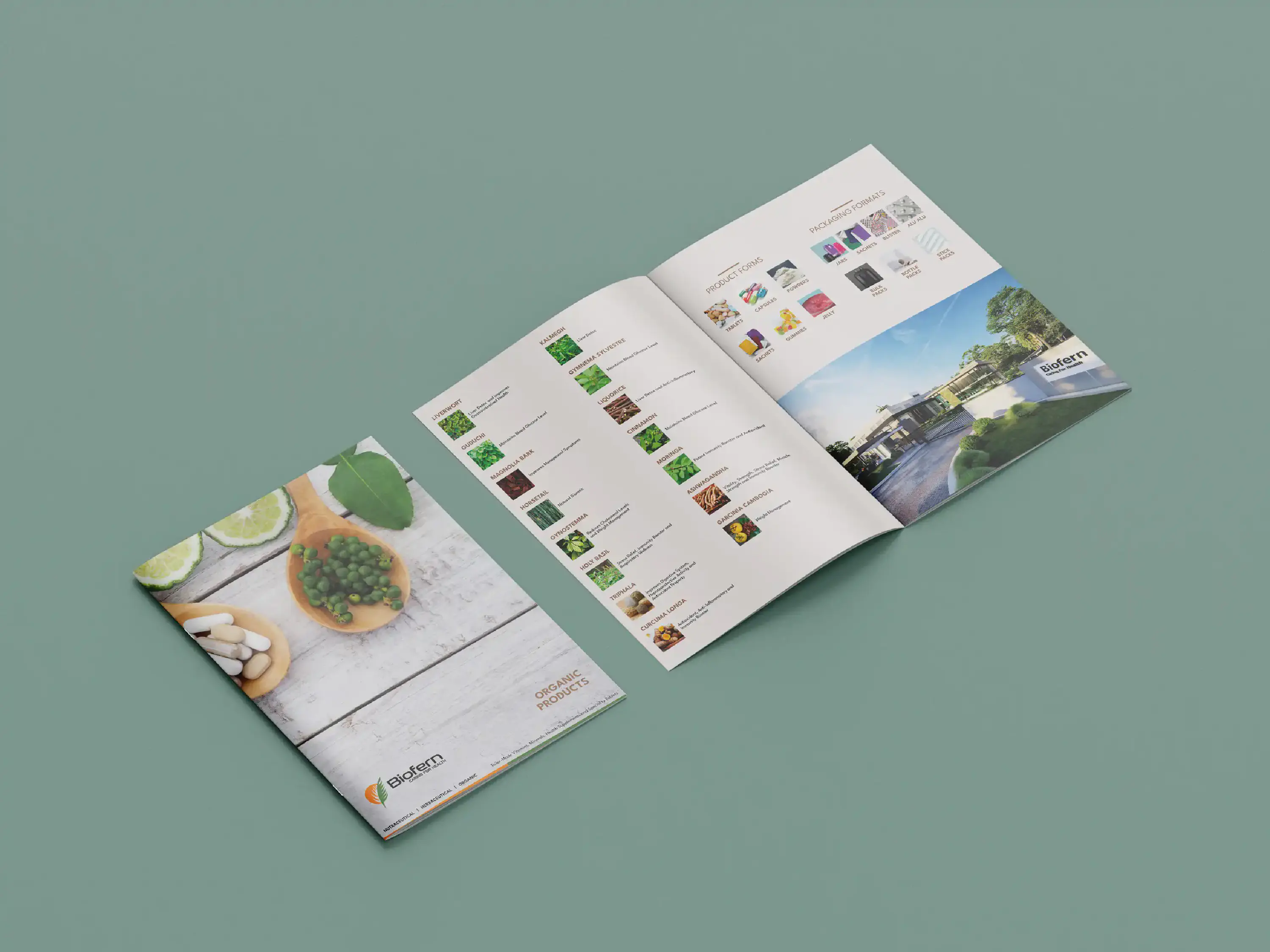
The original assignment centered around the creation of a corporate brochure for Biofern Life Sciences, a pharmaceutical company. The brief additionally called for three dedicated product brochures, each to be tailored to spotlight a unique product category.
What sets this effort apart is the seamless integration of the same design language and style that graced the corporate brochure, resulting in a unified and visually captivating brand identity that transcends every facet of their promotional materials.
Click here to view the corporate brochure

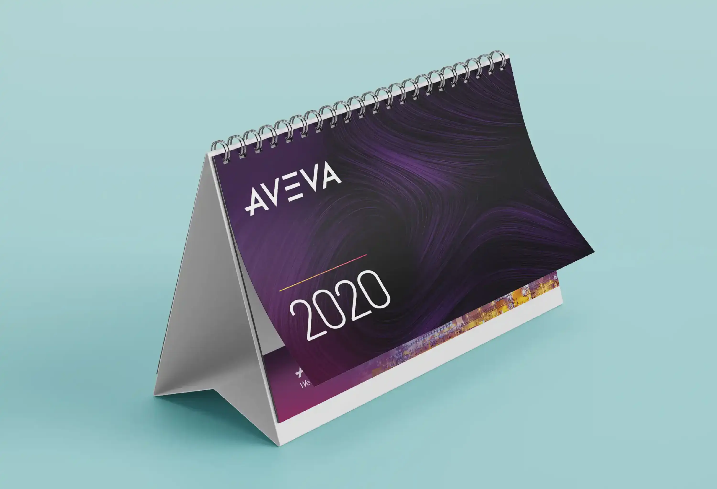
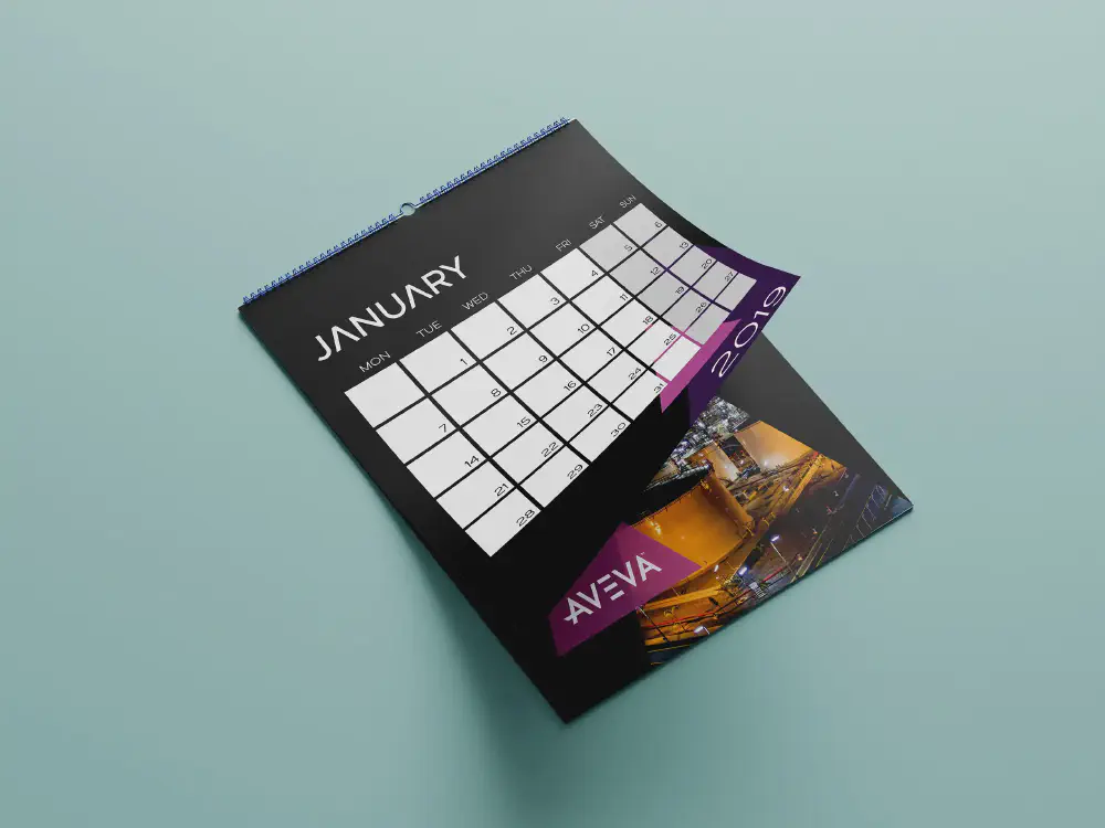
AVEVA, an esteemed I.T. consulting firm, found its wings under the Schneider Electric umbrella in 2023.
The assignment at hand sought to craft corporate calendars intended for internal utilization. These calendars were more than mere date trackers; they were envisioned as reflective embodiments of the company’s essence and its cherished values. In this innovative marriage of form and function, the calendars became more than mere organisational tools; they metamorphosed into symbols of unity, purpose, and shared commitment. AVEVA’s vision thrived in every day, resonating through a beautifully crafted tapestry that connected the dots between time, values, and a collective future.
Other work done for AVEVA: Mailers
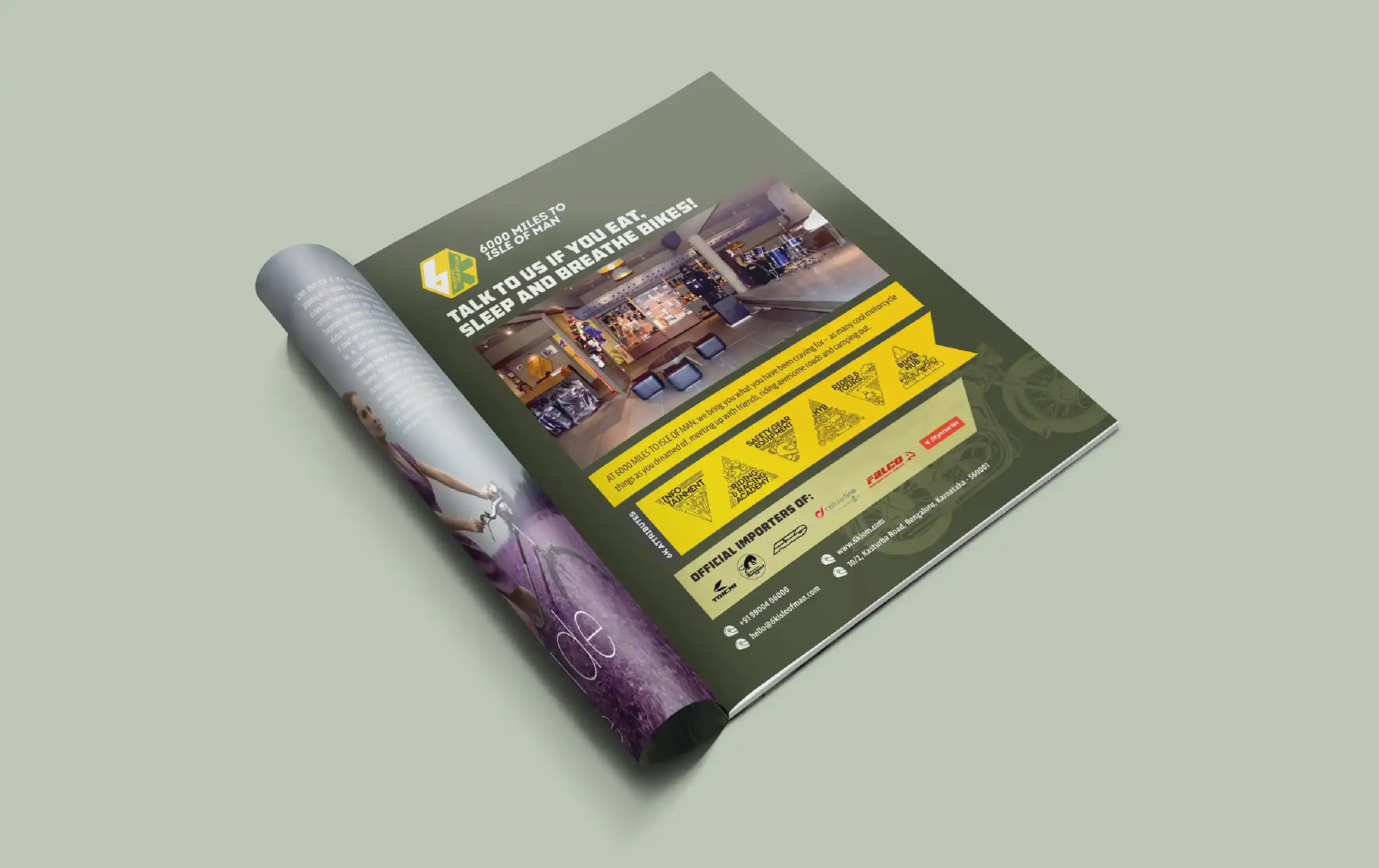
Designing a magazine advertisement for the vibrant “6k Isle of Man” biking community and store in India was a fascinating task. The name itself, “6k Isle of Man,” draws intrigue from its geographical location, 6000 miles away from the Isle of Man.
To infuse authenticity into the brand’s identity, their signature military green and yellow colour scheme was employed, creating a visual continuity that resonated with the biking theme. A watermark-style silhouette of a motorcycle adorned the background, inviting readers into the exhilarating world of biking adventures. At the heart of this advertisement was a captivating headline, bold and enticing. It beckoned readers to explore the community’s offerings, setting the tone for a thrilling experience. Beyond aesthetics, the advertisement also highlighted the brand’s values and commitments through their pre-existing illustrative icons. Accompanied by bullet points, enriched with an iconic helmet icon, key information was easily accessible.
In essence, this magazine advertisement wasn’t just about promotion; it was a visual narrative, encapsulating the spirit of “6k Isle of Man” and offering a glimpse into the exciting world of biking and camaraderie it represents.

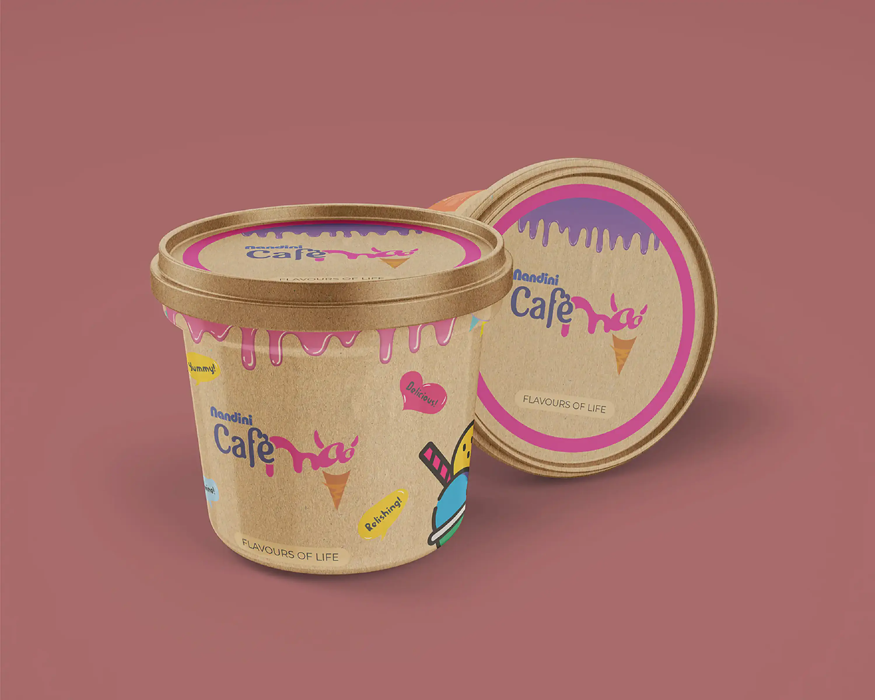
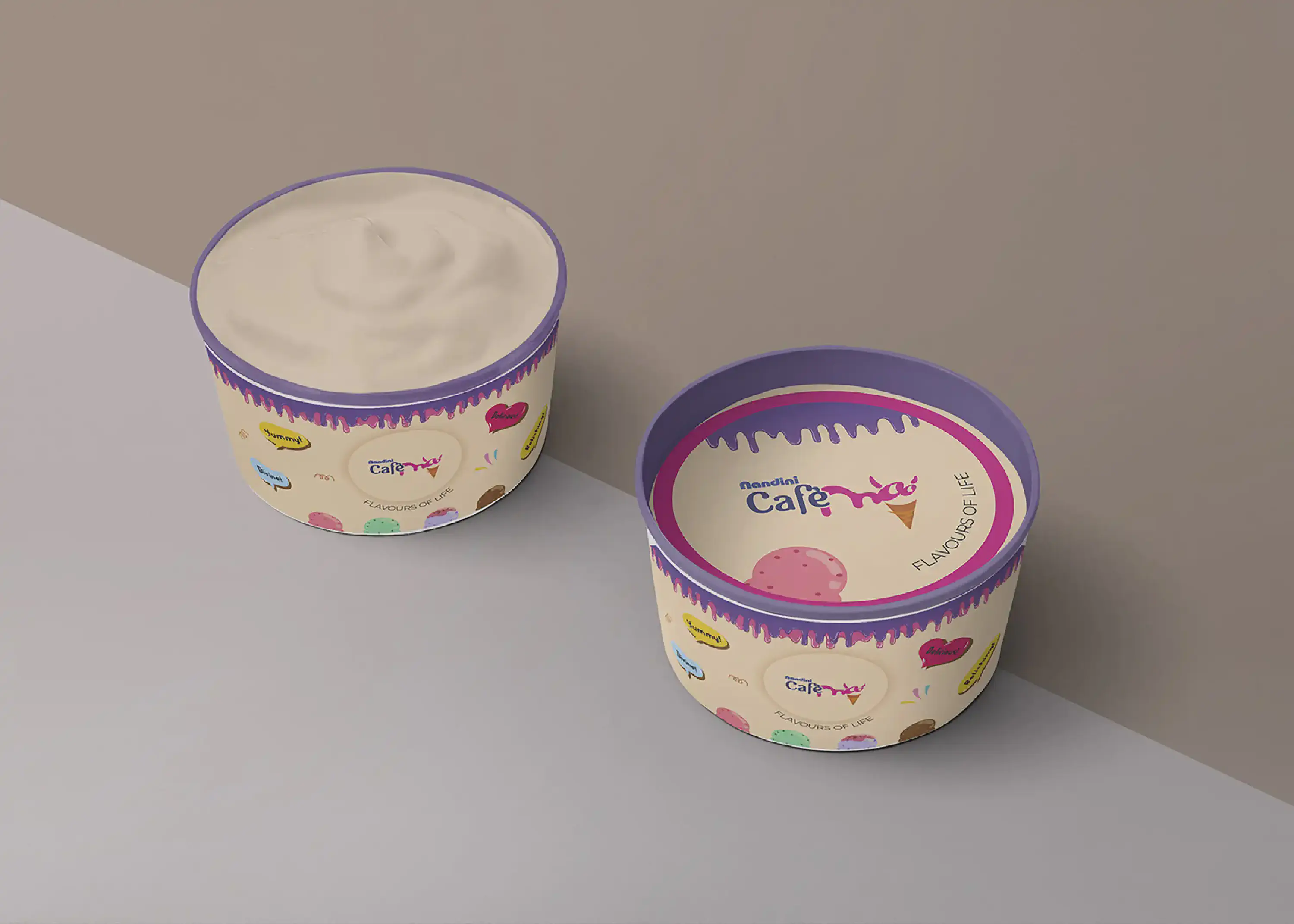
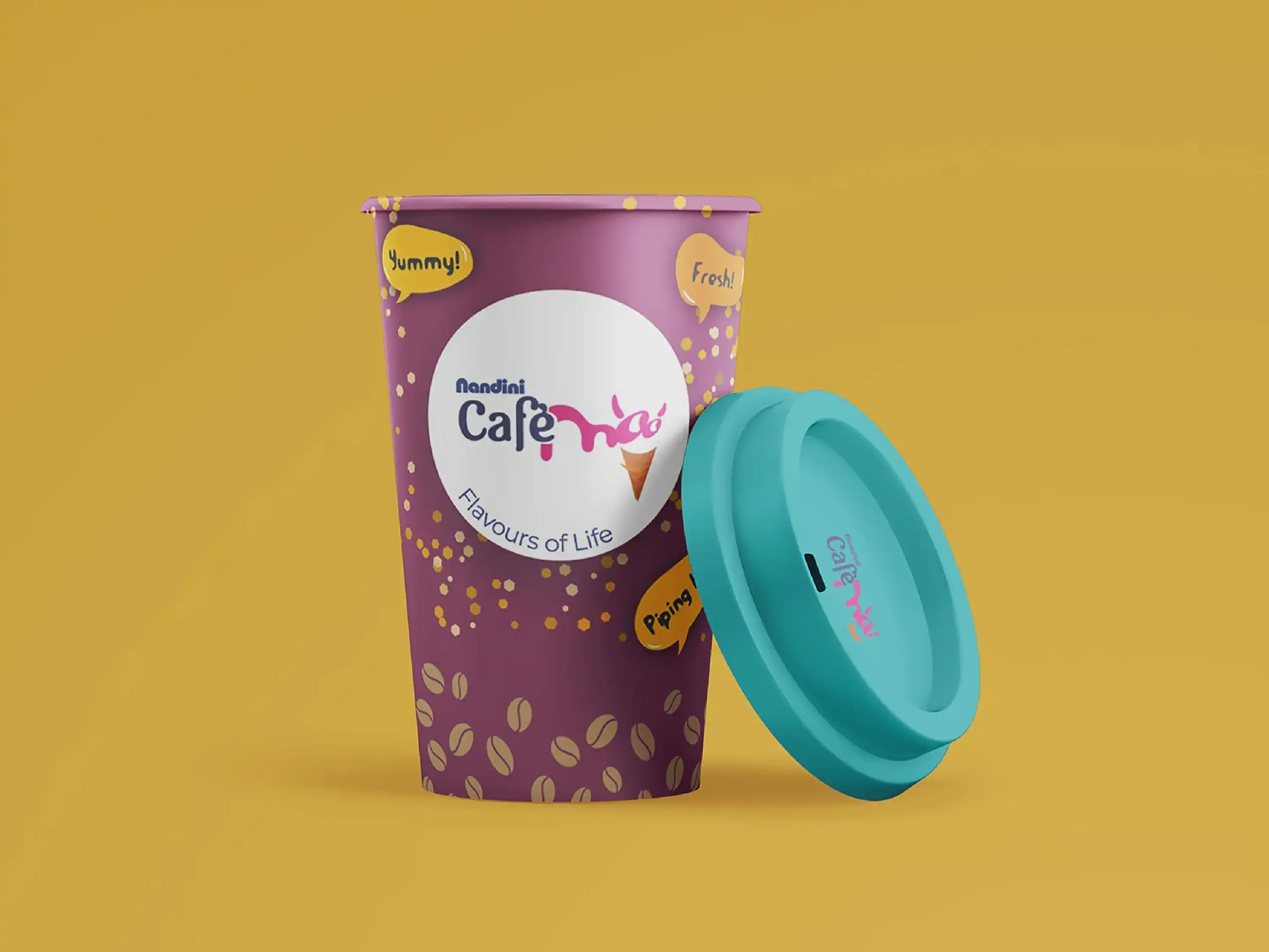
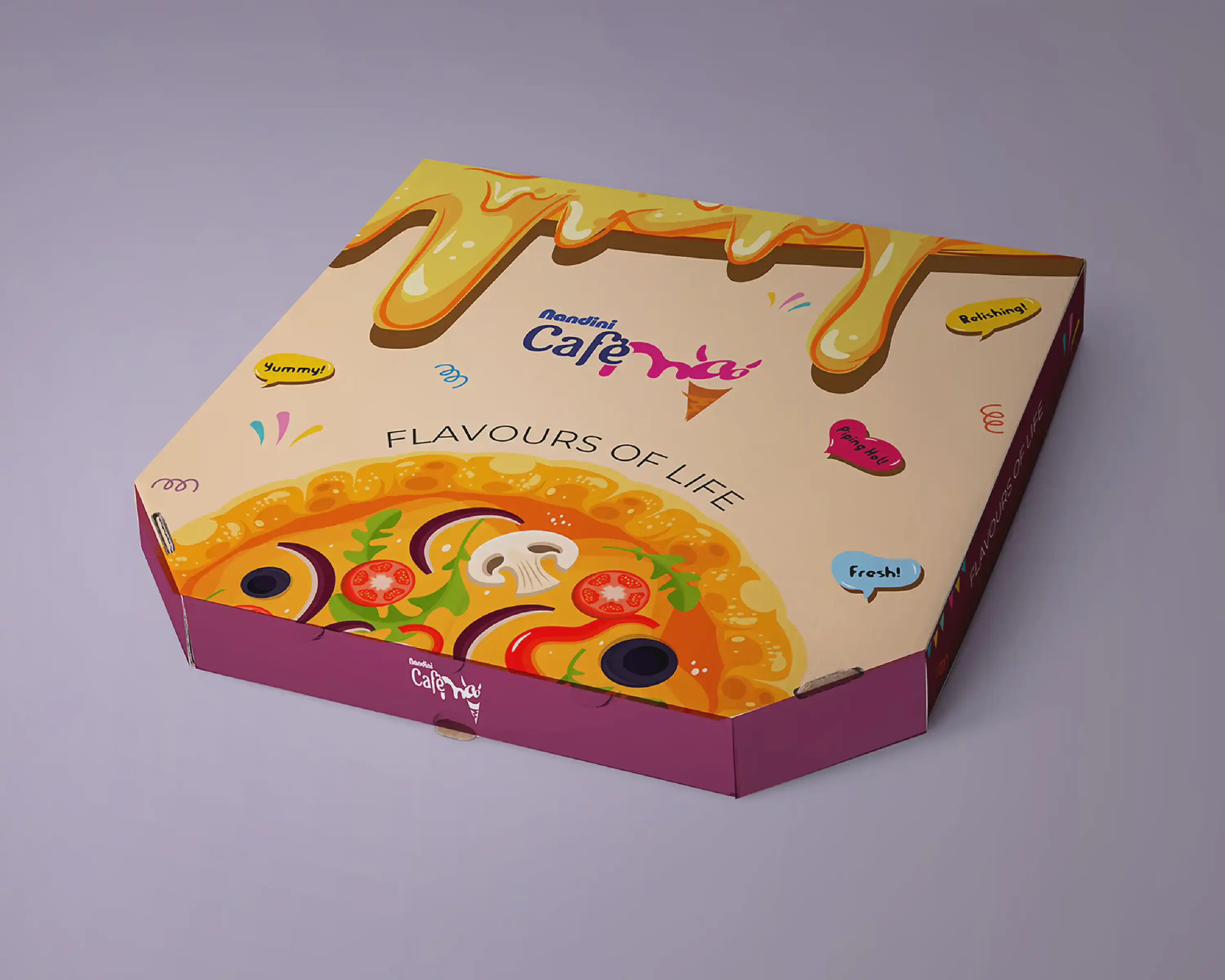
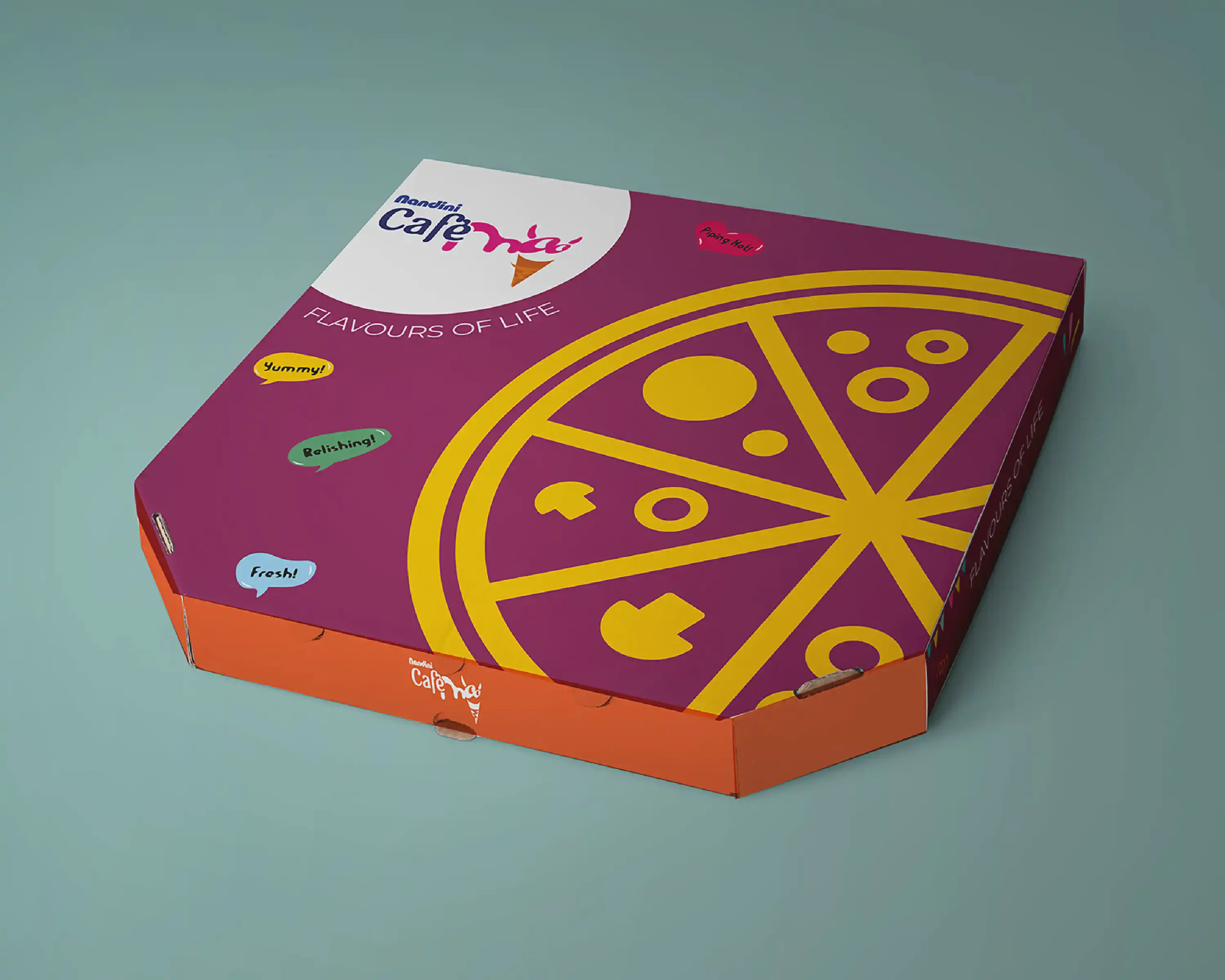
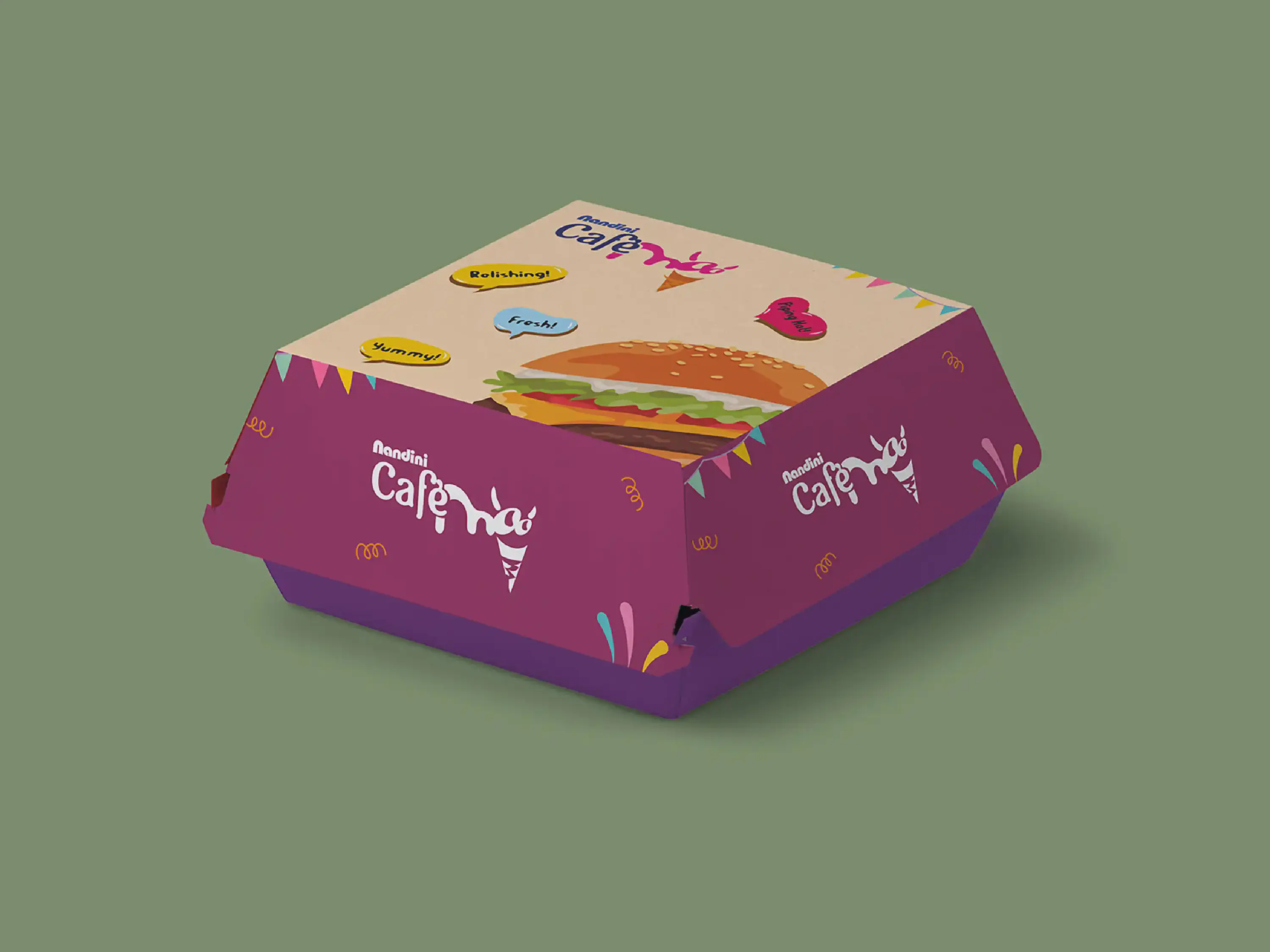
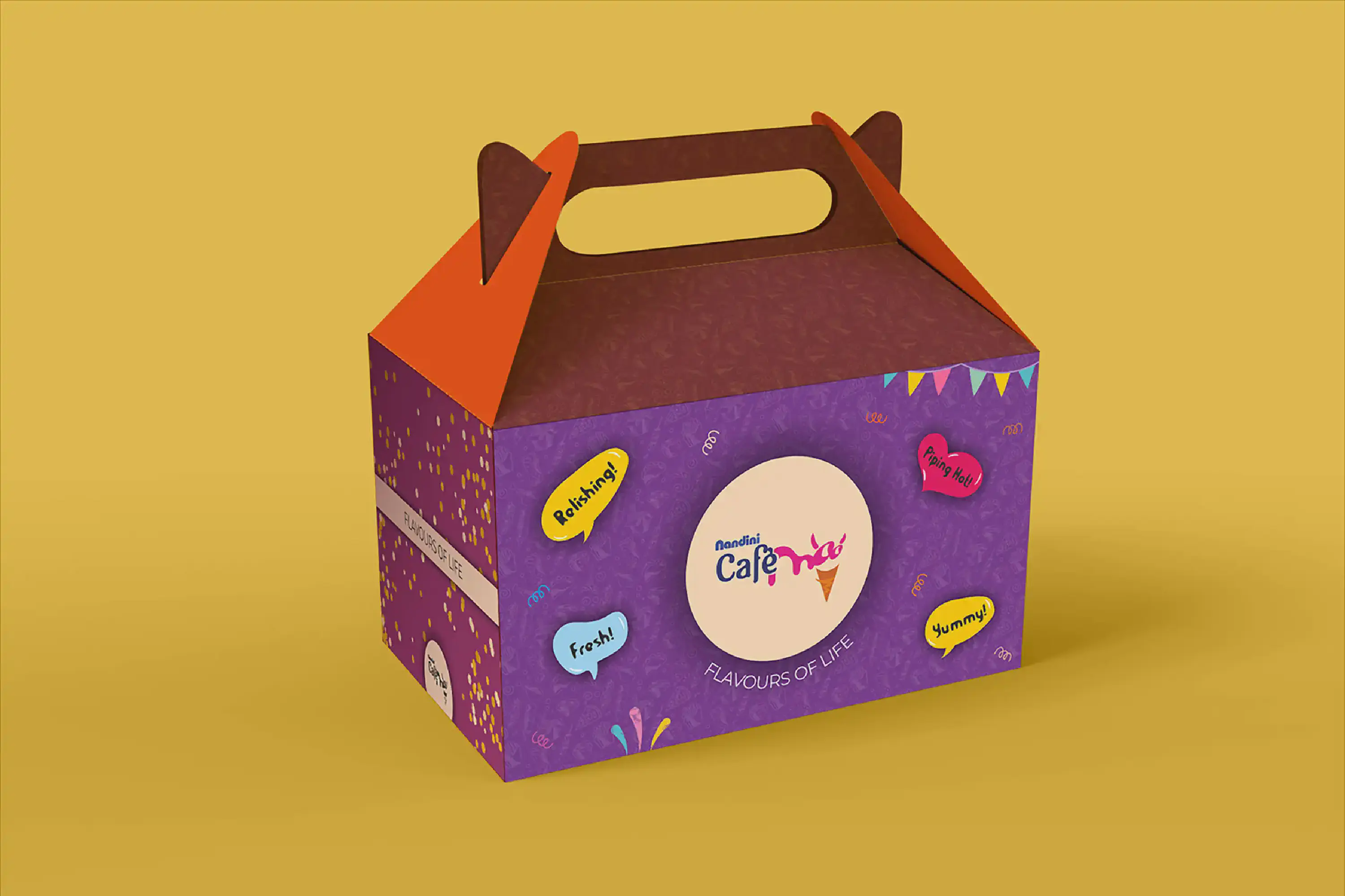
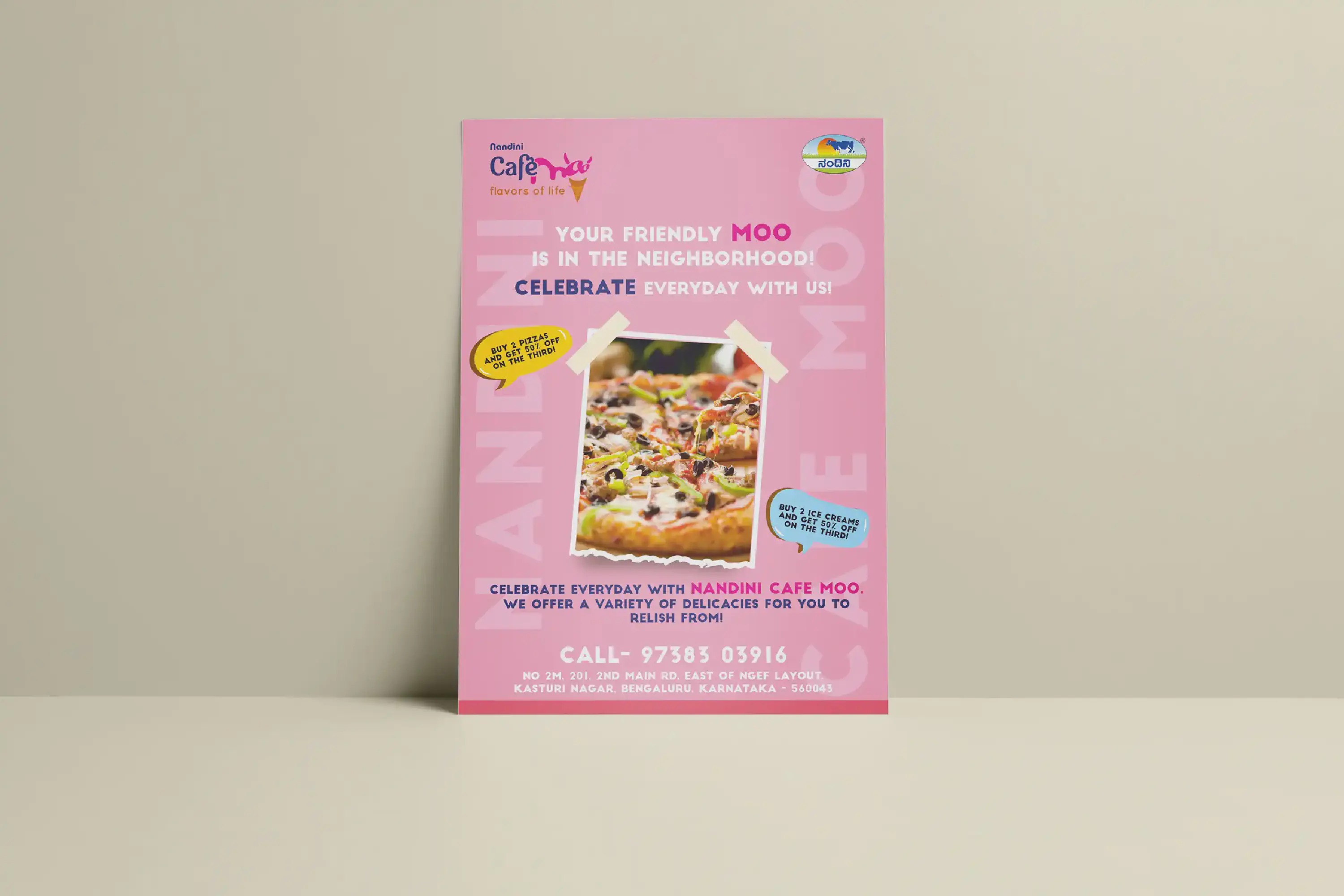
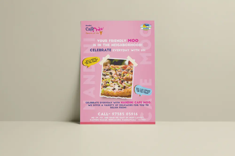
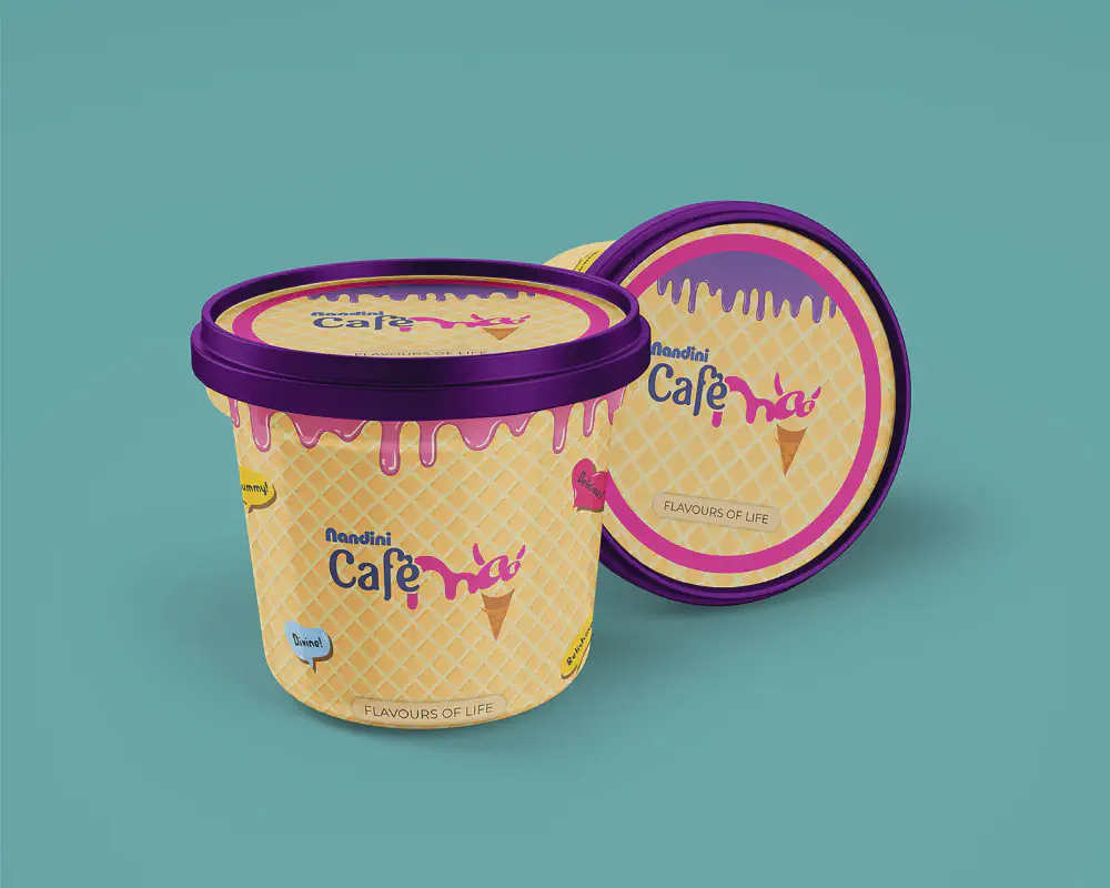
Nandini Café Moo stands as a delightful haven, where the creamy goodness of Nandini milk-based delights merges harmoniously with a tempting array of culinary pleasures like burgers, pizzas, and aromatic coffee. With a resolute vision for transformation, Café Moo embarked on a journey of rejuvenation, seeking a complete overhaul of its in-store identity, menus, and product presentations. The core aspiration was to break free from the confines of conventional Nandini product packaging design and usher in a burst of novelty and vibrancy.
Collaborating within a nimble team, I engaged in exhaustive research, delving deep into the intricacies of this revitalisation. Countless brainstorming sessions enriched by client consultations painted the roadmap for this creative voyage. As one of the project’s orchestrators, I meticulously crafted a plethora of dynamic concepts, infusing them with vibrant hues and allure. These concepts transcended mere designs; they were vibrant symphonies tailored to break the mold of tradition, echoing the essence of Café Moo’s reimagined identity. I fashioned an ensemble of store concepts and packaging mock-ups, each delicately entwined with Café Moo’s spirit and their aspirations. The vision was to transform their offerings into an invitation, beckoning patrons with the promise of an experience that was at once novel and tantalising.
Yet, despite the tireless devotion and creative ingenuity, the project met an unforeseen halt. Its shelving remains shrouded in mystery. However, amidst the twists of fate, I revelled in the journey itself. Every concept imagined, every colour chosen, and every mock-up realised brought a sense of fulfillment, reminding me that the joy of creation transcends outcomes.

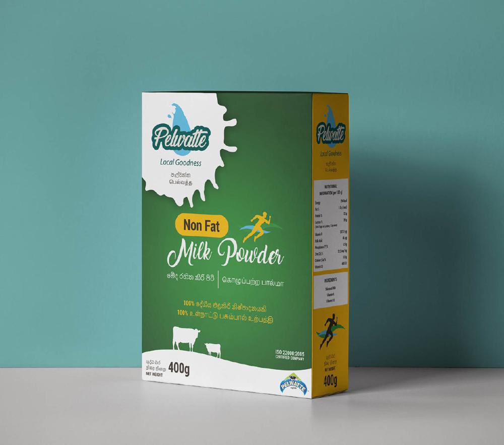
Pelwatte Dairy Industries Ltd stands tall as a frontrunner in the realm of dairy product manufacturing in Sri Lanka. The task at hand was to craft an impeccable box packaging solution for their highly popular milk powder product. The central vision was to encapsulate the inherent freshness and untainted purity of the ingredients, transcending mere functionality to evoke a sensory experience.
With a strategic play of hues, a palette of serene light greens was deftly employed, elegantly intertwining with the purity of pristine white. This amalgamation of colours seamlessly evokes a sense of nature’s bounty, breathing life into the packaging. The inclusion of delicate white milk splashes serves as a visual testament to the product’s essence – a testament of pure, unadulterated freshness. Remarkably, these milk splashes are not merely a design element; they draw inspiration from Pelwatte Dairy’s logo – a milk splash artfully shaped to mirror the geography of Sri Lanka. This ingenious incorporation not only ties the packaging to the brand’s identity but also pays a subtle homage to the product’s origins.
In synergy, these carefully curated elements come together to create a box packaging that transcends the ordinary, ushering in a narrative of untainted purity and uncompromising freshness.
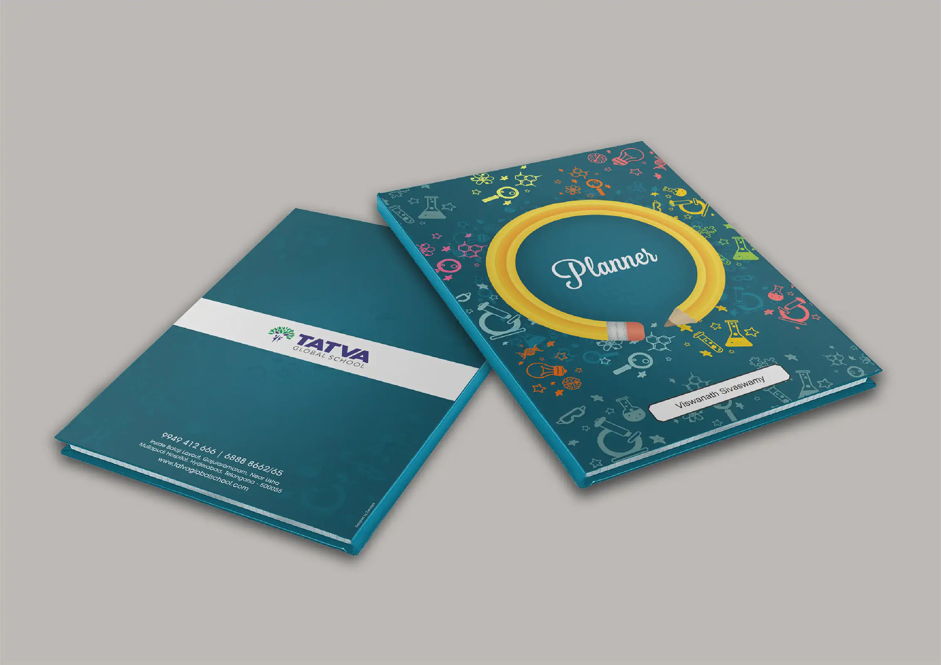
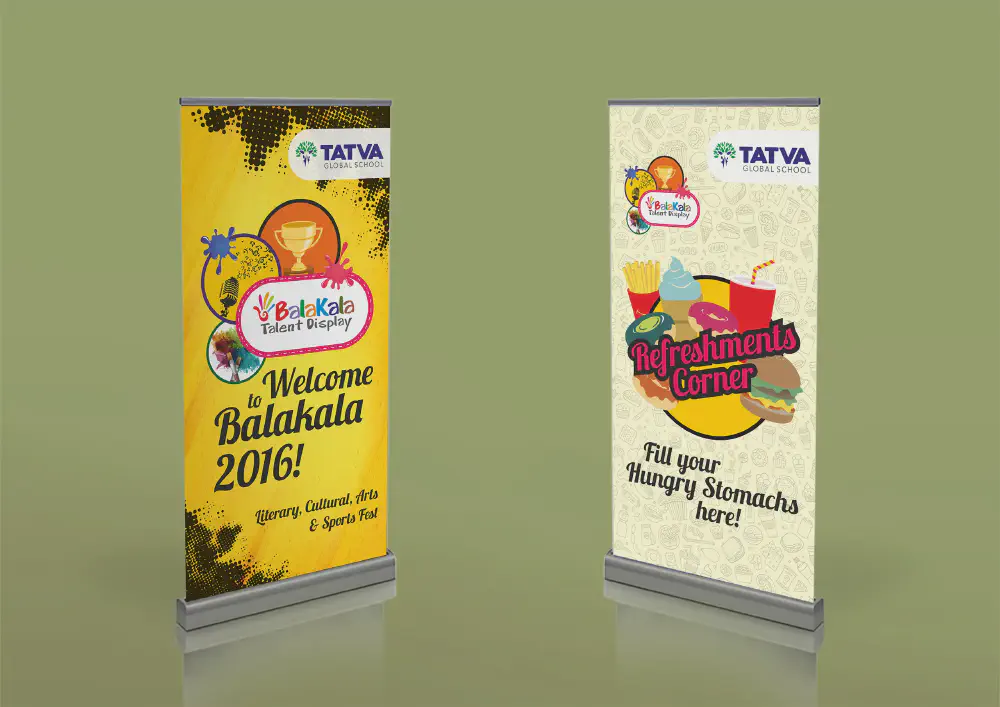
The task at hand entailed the creation of a Teacher Planner diary cover, meticulously tailored for Tatva Global School, with a central focus on the theme of Education.
The iconic Pencil, a timeless symbol synonymous with learning, took center stage in this creative endeavor. Skillfully and prominently featured, it formed the nucleus of the design, artfully surrounded by an array of complementary elements that enriched its narrative. The backdrop itself came alive with an intricate interplay of various elements, contributing to a visual tapestry that reverberates with the spirit of education.
In alignment with the essence of the subject matter, the colour palette played a pivotal role. The selection of the primary hue, blue, was guided by its longstanding association with the world of education. This deliberate choice not only paid homage to tradition but also harmonised seamlessly with the overarching theme, forming a visual symphony that elegantly depicted the ethos of the school.

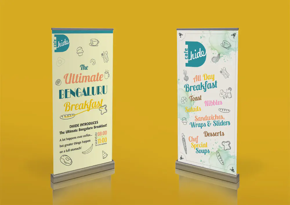
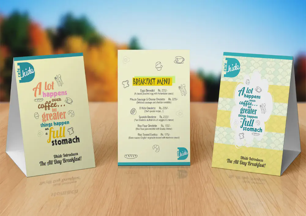
Nestled in the heart of (redacted), was a vibrant Café that had unveiled an enticing innovation: an “All Day Breakfast” menu. Eager to engage its patrons, the Café sought to communicate this delightful offering through an array of meticulously crafted materials. The directive was clear – they envisioned menus, tent cards, and pull-ups that would not only convey information but also captivate the senses. The essence of the brief was to infuse a sense of novelty, a touch of humour, a burst of colour, and an irresistible visual allure into the creatives.
In line with this creative vision, the request extended to table-top tent cards that harmoniously echoed the same captivating theme. Click here to view them
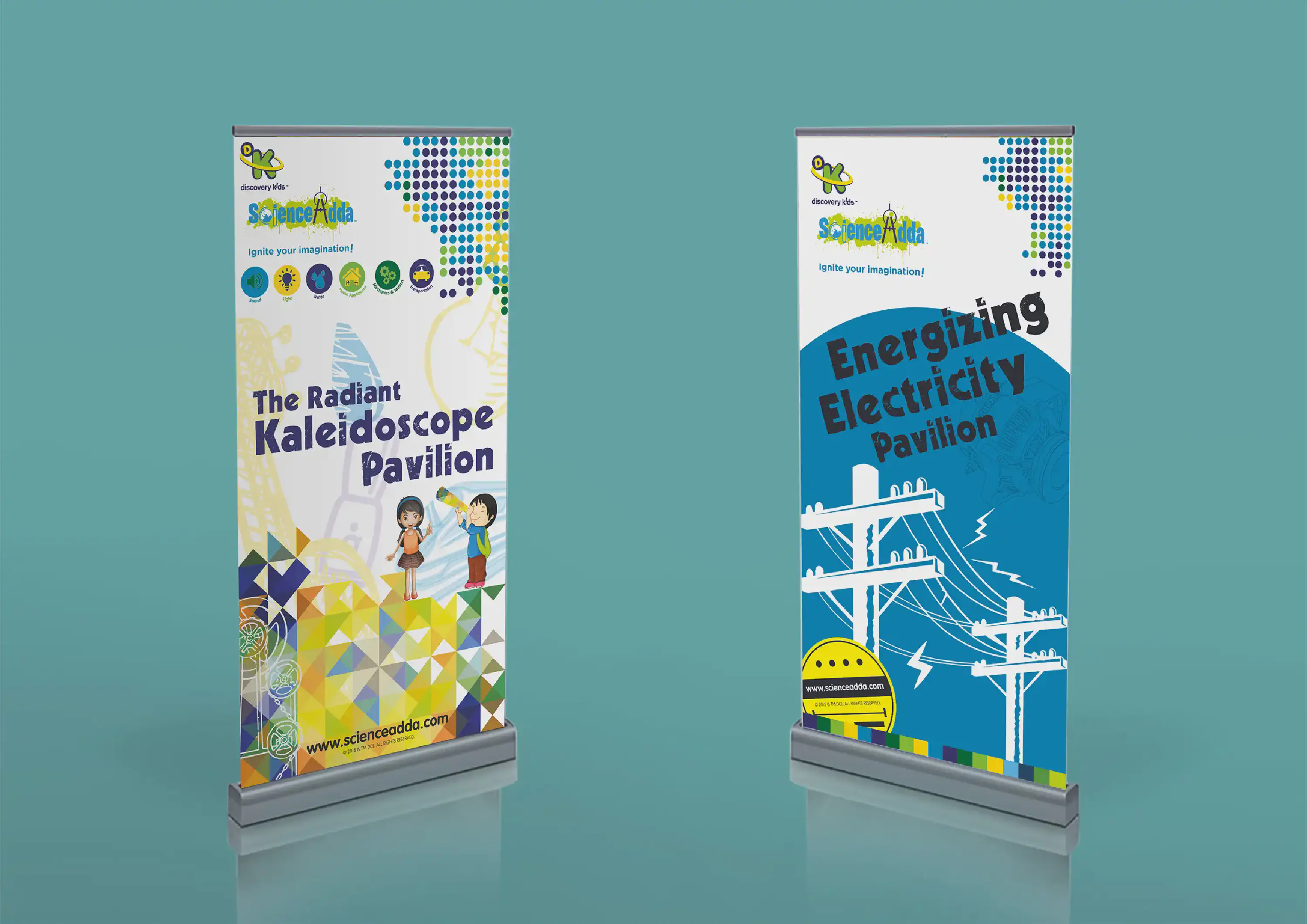
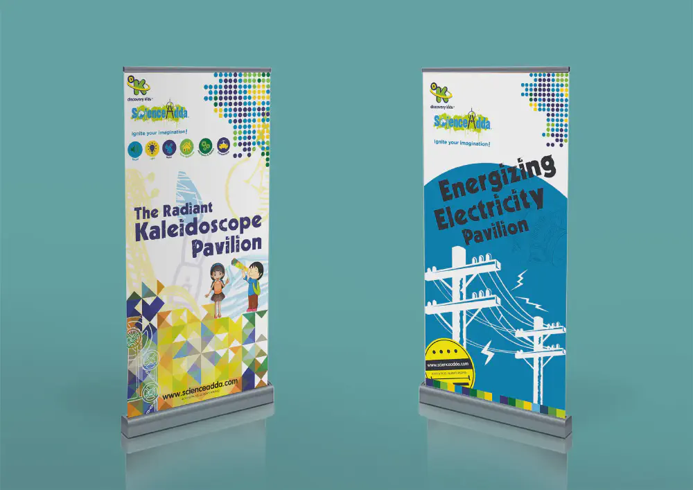
ScienceAdda marks a dynamic partnership with Discovery Channel Kids, pioneering a captivating approach to educating young minds in the realm of science. Departing from conventional textbook methods, this ingenious initiative introduces school children to the wonders of science through immersive and engaging practical experiences. These immersive spaces, referred to as “Pavilions,” serve as vibrant hubs of discovery.
The creative canvas unfolded with the task of crafting compelling roll-ups, poised to enrapture the attention of both adults and children. The directive was clear: to seamlessly marry visual allure with educational intrigue.
The resulting design, a harmonious blend of creativity and knowledge, mirrors the essence of ScienceAdda. The roll-ups stand as beacons of curiosity, resonating with captivating visuals and educational insights. Their magnetic appeal captures the imagination of both young learners and curious minds of all ages, inviting them into a world where science comes to life in vibrant and practical ways.
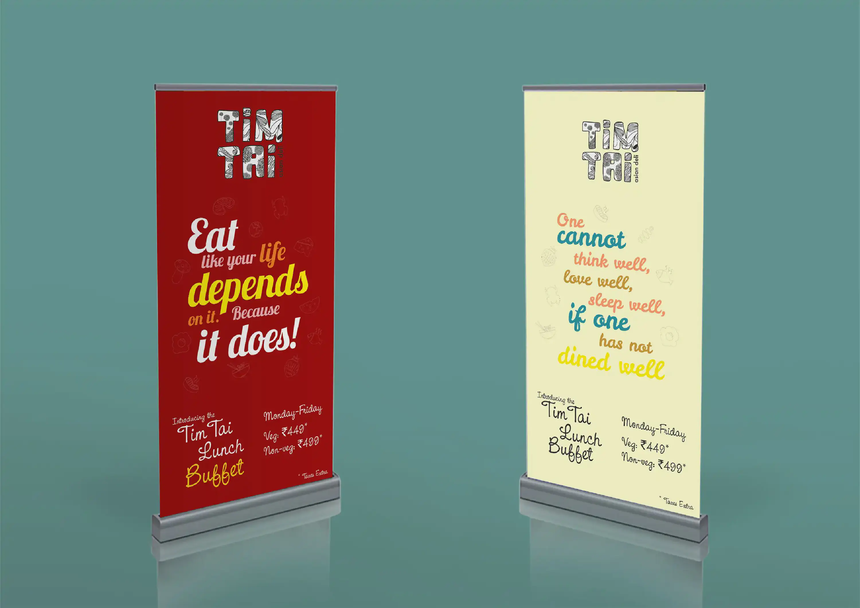
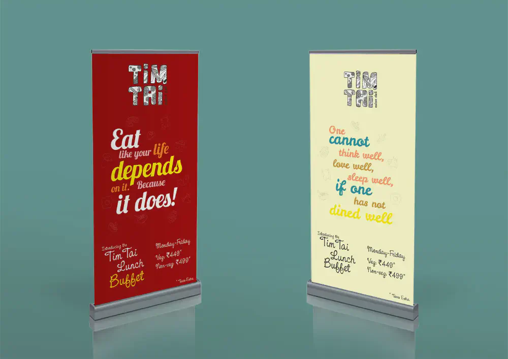
In the bustling cityscape of (redacted), the renowned Tim Tai restaurant had unveiled a tantalising addition to its culinary offerings: a delectable Lunch Buffet. In a bid to spread the word and entice patrons, the restaurant envisioned a dynamic promotional strategy centered around a pair of eye-catching roll-ups. The directive was crystal clear – they yearned for designs that exuded a sense of novelty, injected a touch of humour, and splashed vibrant colours across the canvas to command attention effortlessly. This creative vision harmonises with their commitment to capturing hearts and taste buds alike, while infusing an air of freshness and playfulness into the marketing materials.

Nestled in the heart of (redacted), was a vibrant Café that had unveiled an enticing innovation: an “All Day Breakfast” menu. Eager to engage its patrons, the Café sought to communicate this delightful offering through an array of meticulously crafted materials. The directive was clear – they envisioned menus, tent cards, and roll-ups that would not only convey information but also captivate the senses. The essence of the brief was to infuse a sense of novelty, a touch of humour, a burst of colour, and an irresistible visual allure into the creatives.
In line with this creative vision, the request extended to roll-ups that harmoniously echoed the same captivating theme. Click here to view them