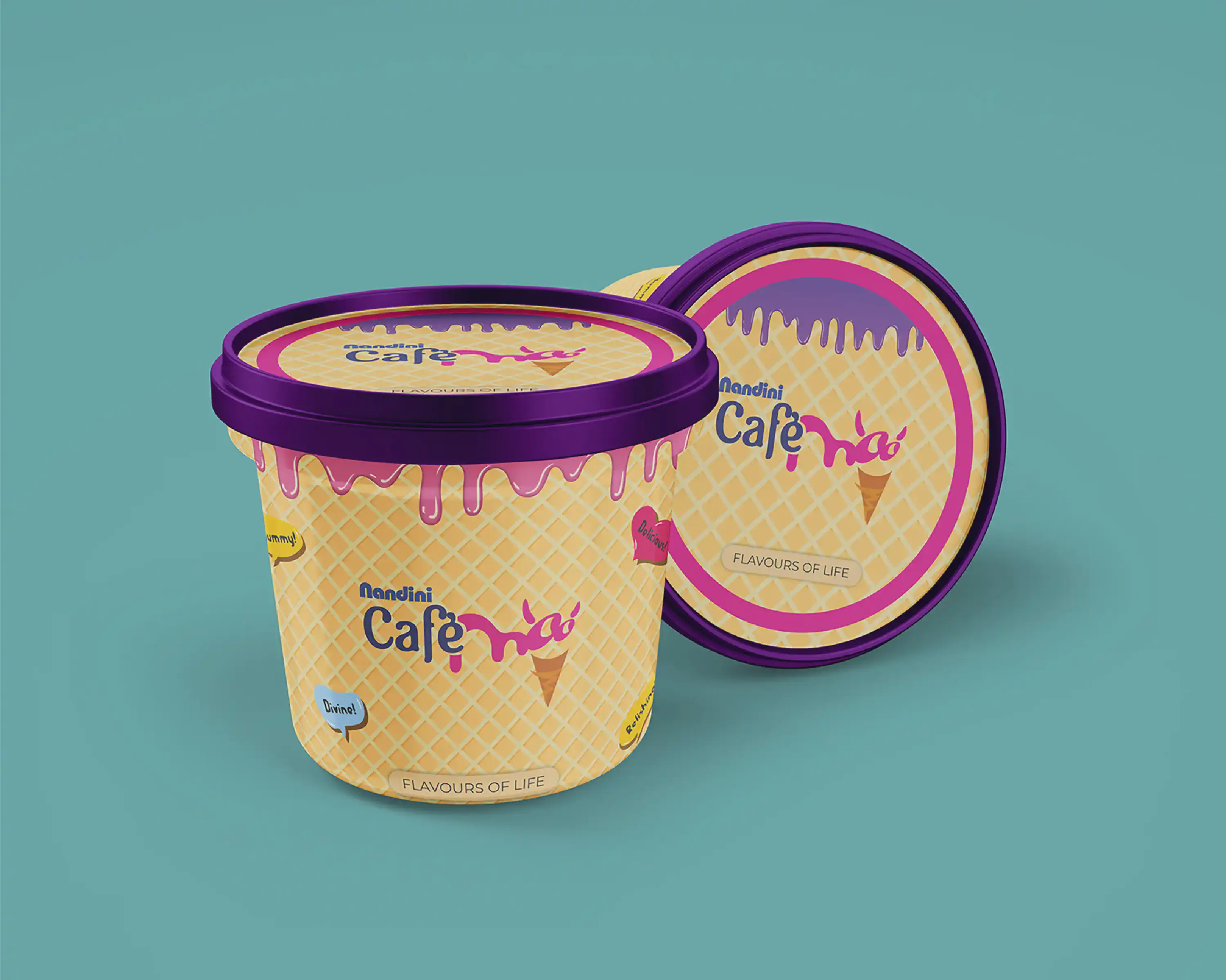
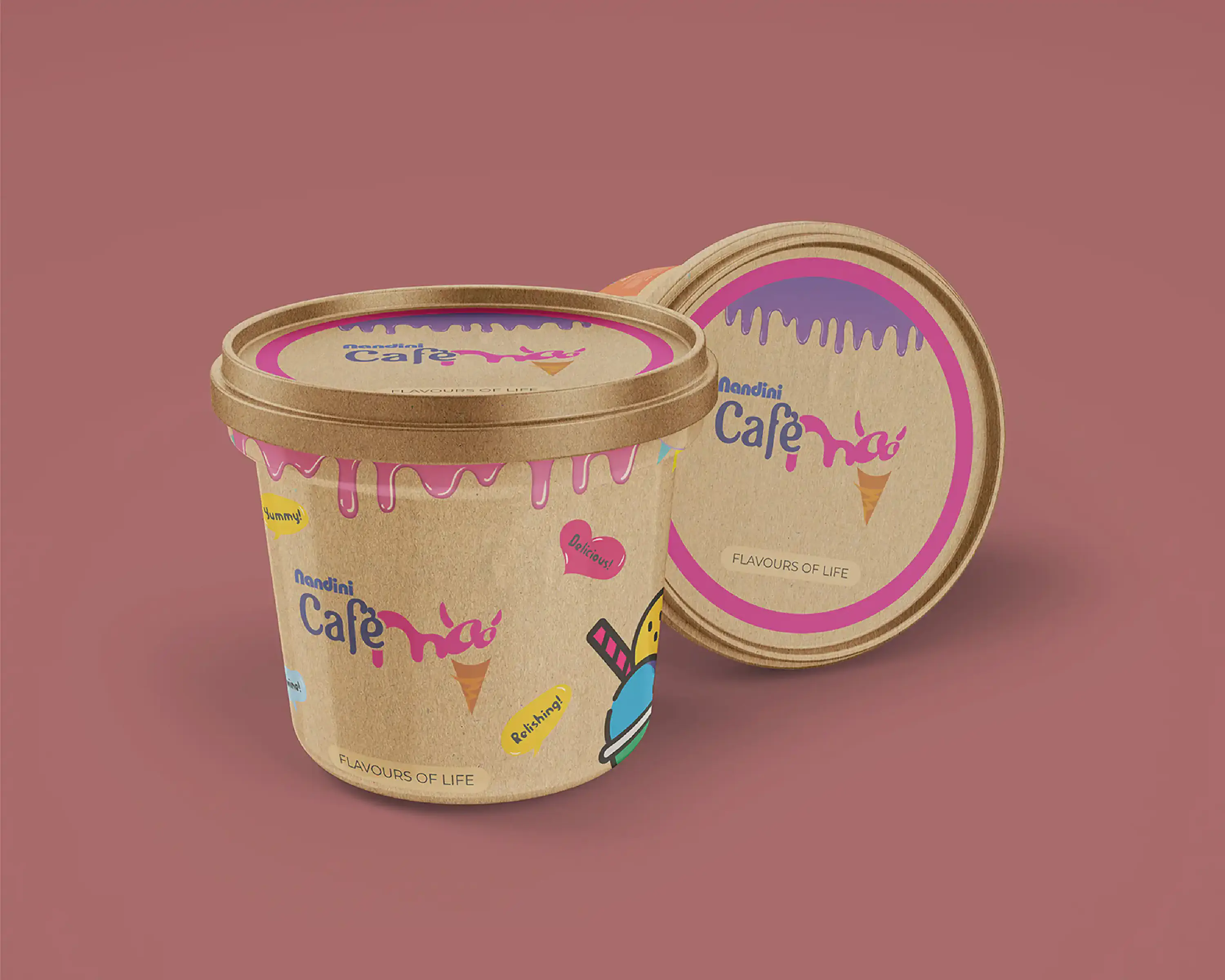
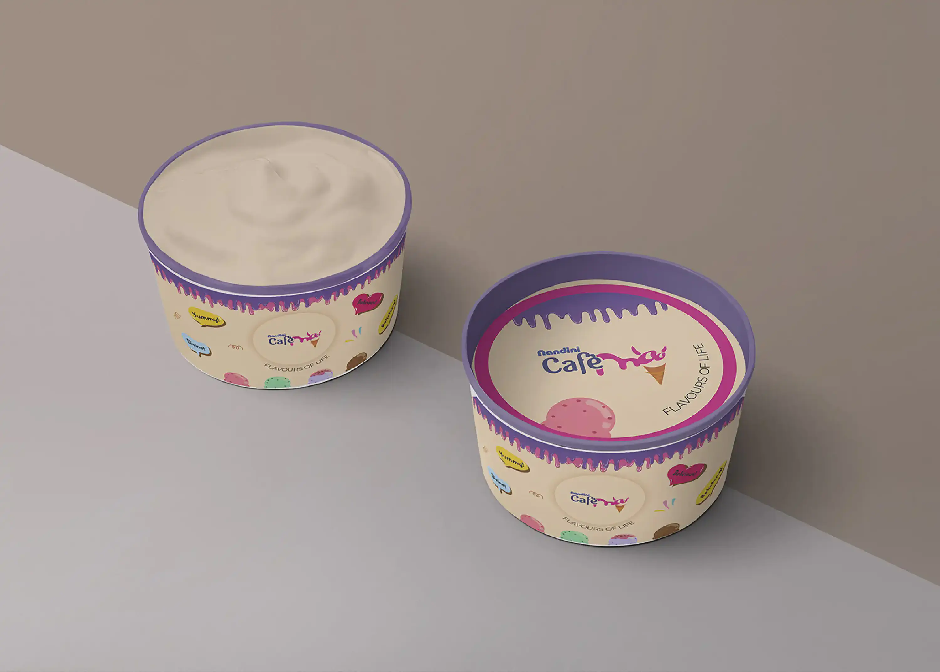
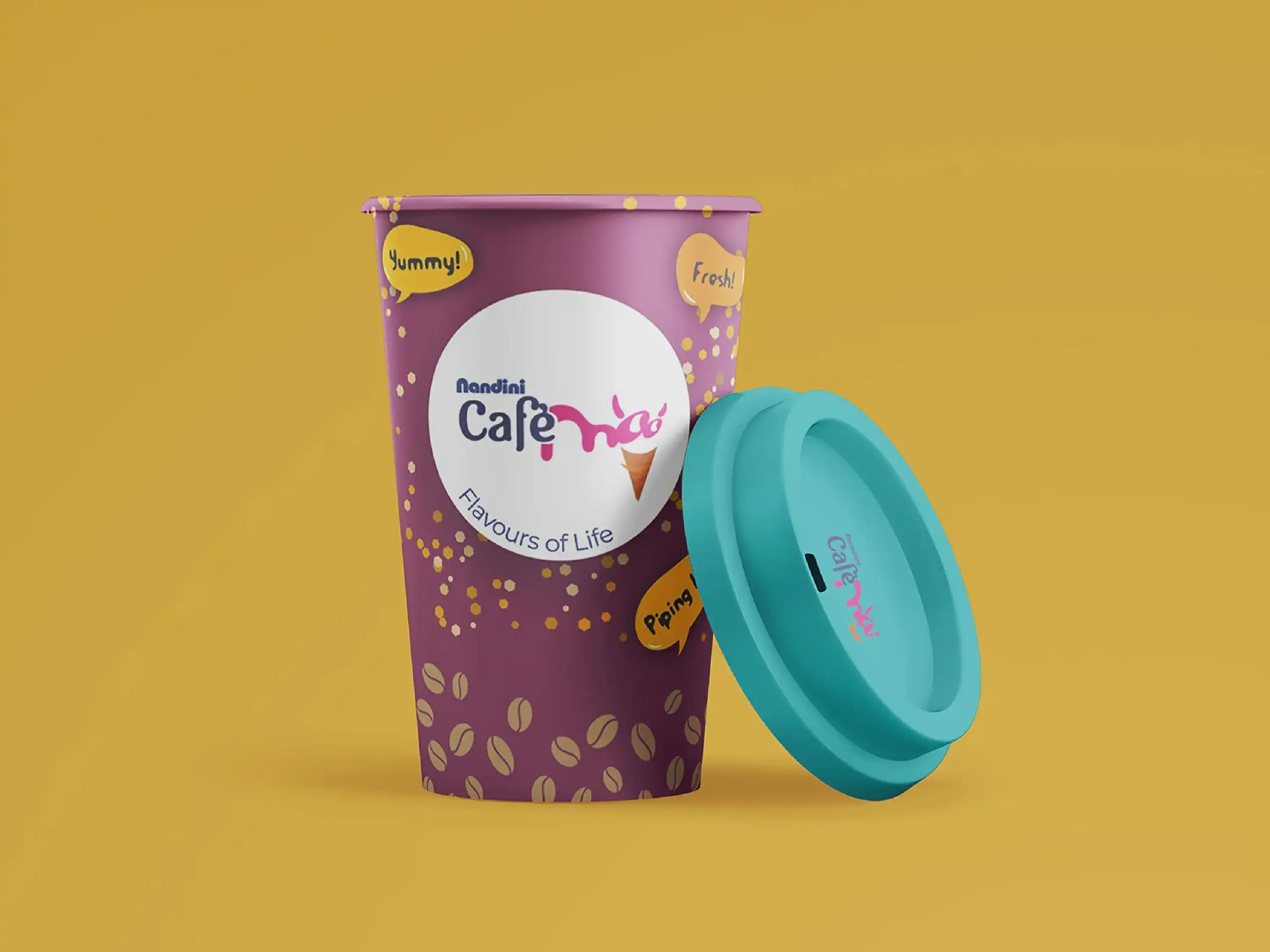
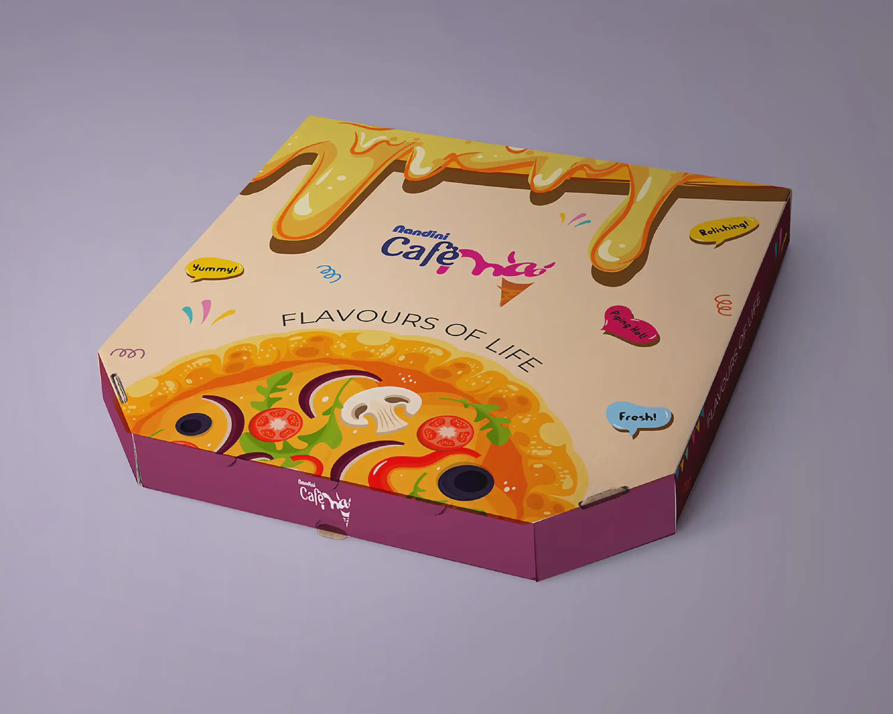
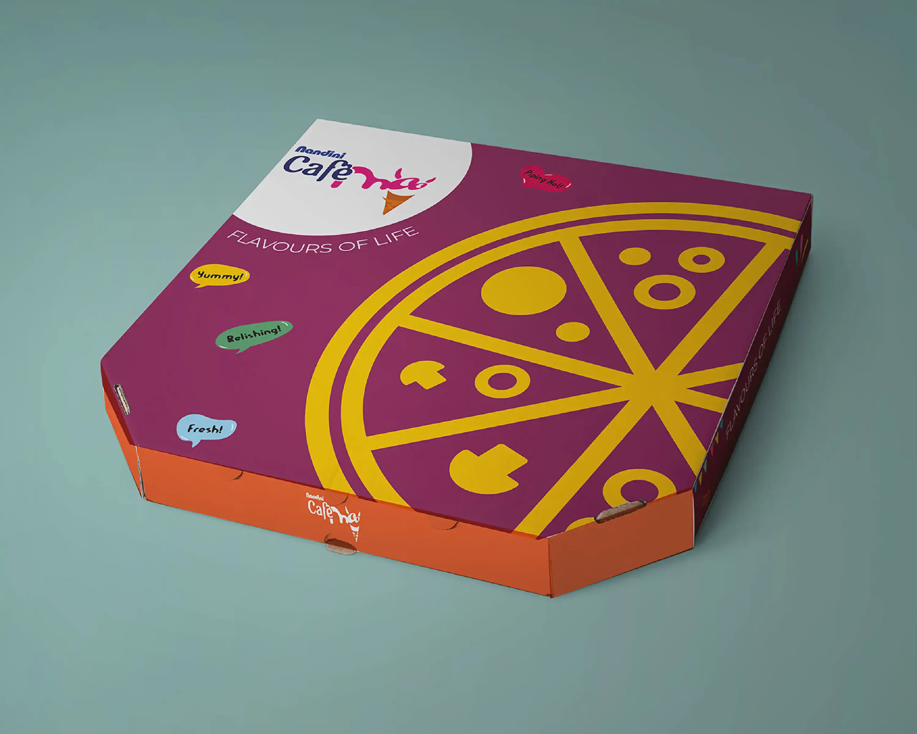
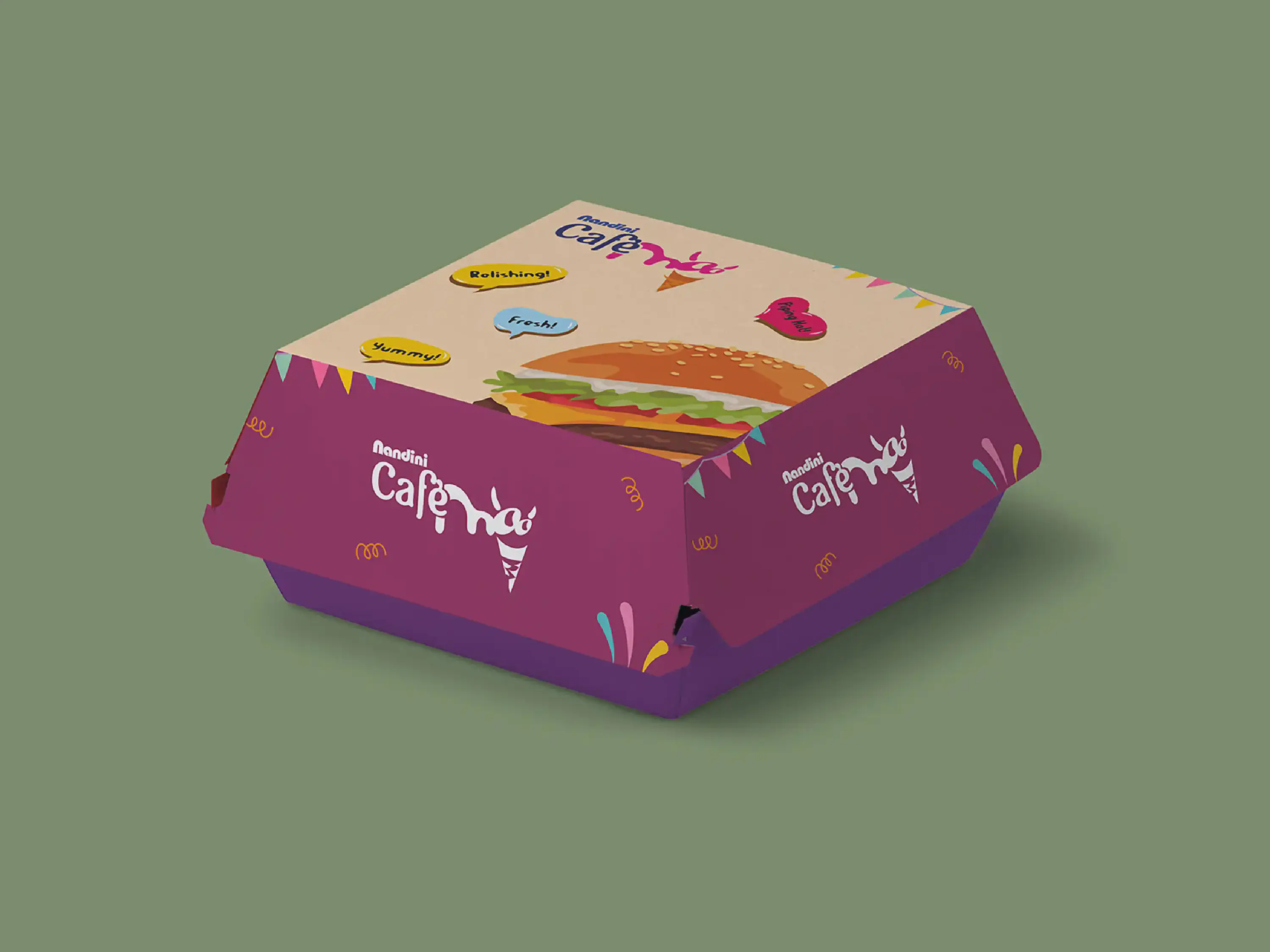
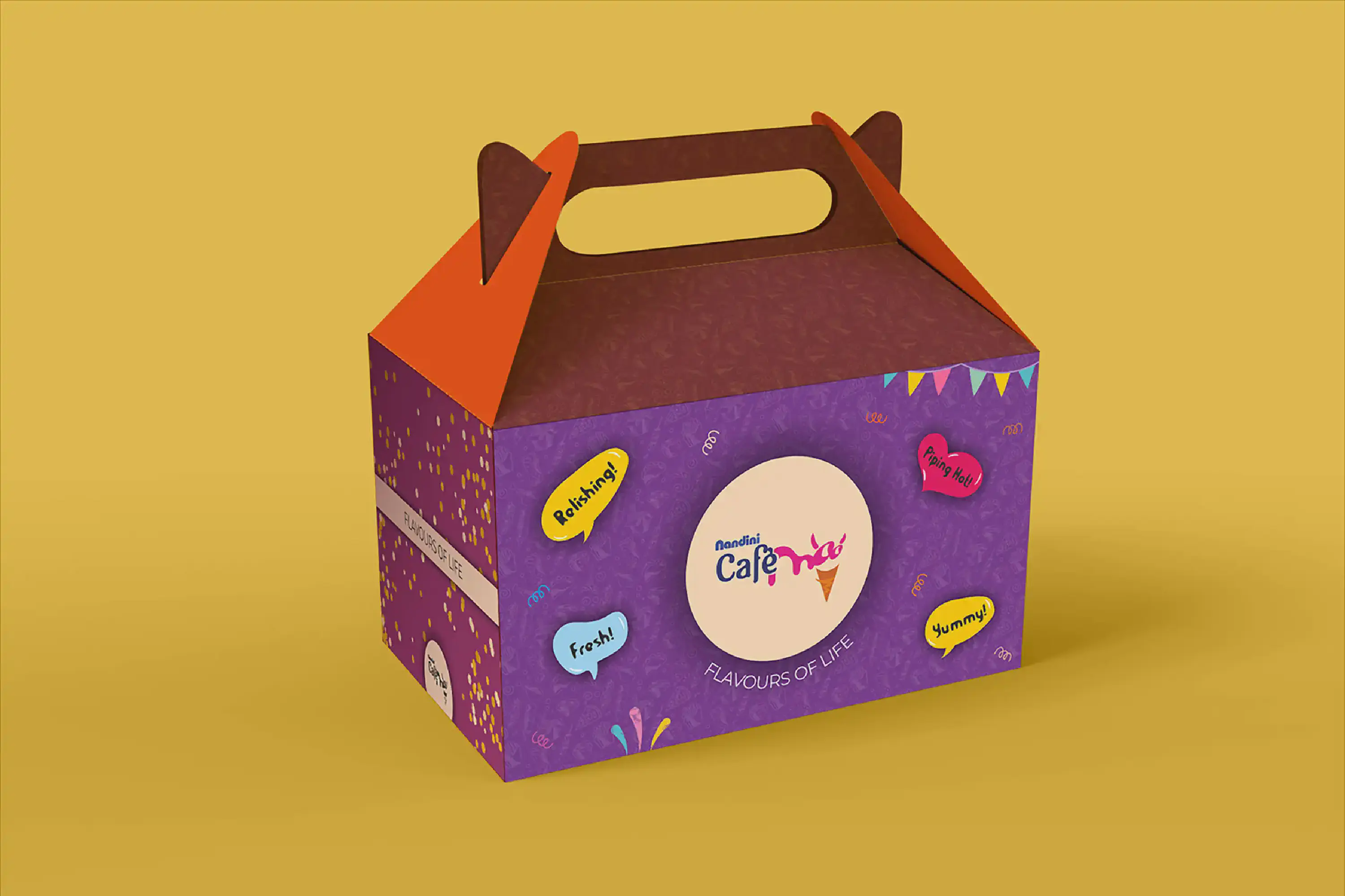
Packaging: Nandini Café Moo
Nandini Café Moo stands as a delightful haven, where the creamy goodness of Nandini milk-based delights merges harmoniously with a tempting array of culinary pleasures like burgers, pizzas, and aromatic coffee. With a resolute vision for transformation, Café Moo embarked on a journey of rejuvenation, seeking a complete overhaul of its in-store identity, menus, and product presentations. The core aspiration was to break free from the confines of conventional Nandini product packaging design and usher in a burst of novelty and vibrancy.
Collaborating within a nimble team, I engaged in exhaustive research, delving deep into the intricacies of this revitalisation. Countless brainstorming sessions enriched by client consultations painted the roadmap for this creative voyage. As one of the project’s orchestrators, I meticulously crafted a plethora of dynamic concepts, infusing them with vibrant hues and allure. These concepts transcended mere designs; they were vibrant symphonies tailored to break the mold of tradition, echoing the essence of Café Moo’s reimagined identity. I fashioned an ensemble of store concepts and packaging mock-ups, each delicately entwined with Café Moo’s spirit and their aspirations. The vision was to transform their offerings into an invitation, beckoning patrons with the promise of an experience that was at once novel and tantalising.
Yet, despite the tireless devotion and creative ingenuity, the project met an unforeseen halt. Its shelving remains shrouded in mystery. However, amidst the twists of fate, I revelled in the journey itself. Every concept imagined, every colour chosen, and every mock-up realised brought a sense of fulfillment, reminding me that the joy of creation transcends outcomes.