Mailer & Social Media Post: Big Biking Commune

Big Biking Commune stands as a premier biking community in India, dedicated to exalting the very spirit of biking.

The task at hand involved crafting a promotional mailer and striking social media posts, aimed at illuminating an upcoming motorcycle festival orchestrated by the community, designed explicitly to beckon new members into its fold. Drawing inspiration, a bold and commanding font took center stage, complemented by a judicious selection of two distinct hues. Against a backdrop as deep as the night, the focal point was a motorcycle tire – an unmistakable emblem of motorcycling.

The outcome was an embodiment of Big Biking Commune’s core, that not only harnessed the power of design but also encapsulated the thrill and camaraderie intrinsic to the realm of biking.

In line with their requirements and the same creative vision, four additional social media posts were created for a different set of dates. They can be viewed here.


Mailers & Landing Pages: IBM

Will be added soon!


Mailers: AVEVA

AVEVA, an esteemed I.T. consulting firm, found its wings under the Schneider Electric umbrella in 2023.

The task at hand beckoned for the creation of mailers adopting an infographic style. Their purpose was twofold: to spotlight a pertinent quandary plaguing India’s shipping trade and to present a compelling remedy in tandem. Harnessing the potency of visual communication, the infographics encapsulated the intricacies of the issue at hand. With strategic symbology and insightful data representation, the challenge facing the shipping industry was unveiled. A harmonious fusion of imagery and information converged to illuminate the pressing concern.

Furthermore, ingeniously integrated into this visual narrative was the proposed solution—a beacon of innovation and pragmatism. The symbiotic blend of textual insights and graphical elements coalesced to map out the transformative path forward. This endeavor was a testament not only to AVEVA’s proficiency but also its commitment to instigate impactful change through the synergy of strategic consulting and creative visualization.

Other work done for AVEVA: 2019 & 2020 Corporate Calendars


Mailers: Miscellaneous

Durga Petals | Advaitha Aksha | Tatva Global School


Mailers: Privafy

The directive encompassed the creation of emailers focused on the pivotal theme of data security for Privafy, a forward-thinking entity championing a state-of-the-art cloud-based Software-as-a-Service solution meticulously tailored to cater to the distinctive requisites of carriers, IoT networks, and enterprises.

The first mailer served as an introduction to Privafy, unveiling its core essence. Furthermore, its prime audience – carriers, IoT networks, and enterprises – who stand to reap immeasurable benefits from its offerings were highlighted. The background wove a visual tapestry of connectivity and security with a subtle yet evocative image of circuitry and data flow. Additionally, attractive icons and their corresponding bite-sized explanations to forge a bridge between complexity and comprehension were also used. These visual cues transformed mere points into a compelling narrative, inviting recipients to explore the multifaceted dimensions of Privafy’s comprehensive security solution.

Transitioning to the second emailer, the spotlight was cast upon the stark reality of data theft, embodied by a central image that resonated with urgency. This visual tableau served as a rallying cry, underlining the very challenge that Privafy gallantly combats. Once again, icons and concise descriptions converged to spotlight other crucial facets, fostering an intuitive grasp of the company’s breadth.


Social Media Posts: Big Biking Commune

Big Biking Commune stands as a premier biking community in India, dedicated to exalting the very spirit of biking.

The task at hand involved crafting a promotional mailer and striking social media posts, aimed at illuminating an upcoming motorcycle festival orchestrated by the community, designed explicitly to beckon new members into its fold. Drawing inspiration, a bold and commanding font took center stage, complemented by a judicious selection of two distinct hues. Against a backdrop as deep as the night, the focal point was a motorcycle tire – an unmistakable emblem of motorcycling.

The outcome was an embodiment of Big Biking Commune’s core, that not only harnessed the power of design but also encapsulated the thrill and camaraderie intrinsic to the realm of biking.

The original mailer and single social media post can be viewed here.


Social Media Posts: Kawasaki

The task entailed creating a captivating series of social media posts, strategically designed to amplify the launch of Kawasaki Bajaj’s exhilarating range of motorcycles for the first time in the Indian market. The design direction embraced bold typography, accentuated by the iconic Kawasaki green hue, which made frequent appearances, ensnaring attention with every scroll.

Kawasaki is known for their engineering prowess and a legacy of speed. With a history etched in adrenaline and innovation, Kawasaki’s two-wheeled marvels are a symphony of power, precision, and style. This very essence was translated into the social media campaign, where dynamic visuals and commanding fonts echoed the spirit of their motorcycles, witht the aim of captivating Kawasaki enthusiasts across India.

Other work done for Kawasaki: Mailers


Websites: Andhra Medi Pharma India Pvt. Ltd.

Corporate website revamp


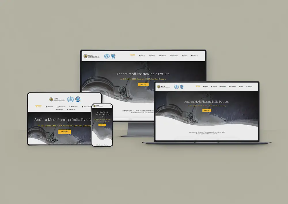
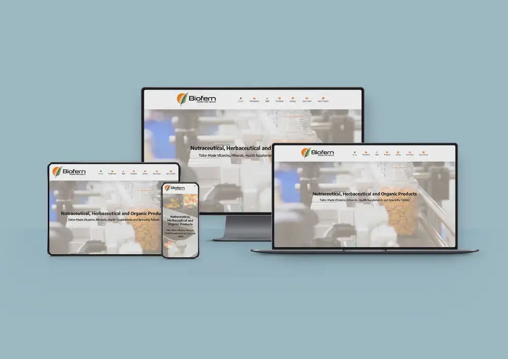
Websites: Biofern Life Sciences Pvt. Ltd.

The task at hand was to conceive a fresh and dynamic corporate website for Biofern Life Sciences, a pharmaceutical company. The website seamlessly integrated the brand’s logo colours, saffron and green into its design, elegantly framing borders, menus, and buttons throughout the site.

At the forefront of the website’s visual allure were striking, high-definition images that showcased the intricate process of medicine production. These captivating visuals served as hero images, commanding attention and complemented by bold headlines that succinctly conveyed Biofern’s commitment to excellence.

What made this project particularly remarkable was the utilisation of WordPress, a versatile platform that allowed me to build the entire website without the need to delve into code. This user-friendly approach ensured that the website was not only visually appealing but also highly accessible and easy to navigate.

In the end, the website emerged as a testament to the fusion of design prowess and technological efficiency. It effortlessly encapsulated the essence of the company, inviting visitors into a world of innovation and dedication, all with the click of a button.


Websites: LogJob

Will be added soon!


Websites: Rohan Moorthy

Personal website revamp


Invitations: Biofern Inauguration

Will be added soon!